Learn Coding Visually
Learn to code with interactive, live-preview playgrounds — HTML, CSS, JavaScript, React & more.
 HTML Playground42 lessons · Click-based · Live preview
 CSS PlaygroundLearn CSS with a live editor
 JavaScript Playground60 lessons · DOM · Async · Canvas
 React PlaygroundLearn React with a live code editor
 GSAP PlaygroundLearn GSAP animation interactively
 SVG Playground44 lessons · shapes · paths · animation
 SCSS Playground45 lessons · Sass modules · tokens
 Tailwind PlaygroundLearn Tailwind CSS with a live editor
 Bootstrap 5 Playground50 lessons · live preview
CSS Grid Generator — Free HTML CSS JS Snippet
CSS Grid Generator · Dev · Plain HTML, CSS & JS · Live preview
What's included
Features
About this UI Snippet
CSS Grid Generator — Live grid-template-columns, grid-template-rows & Gap Builder
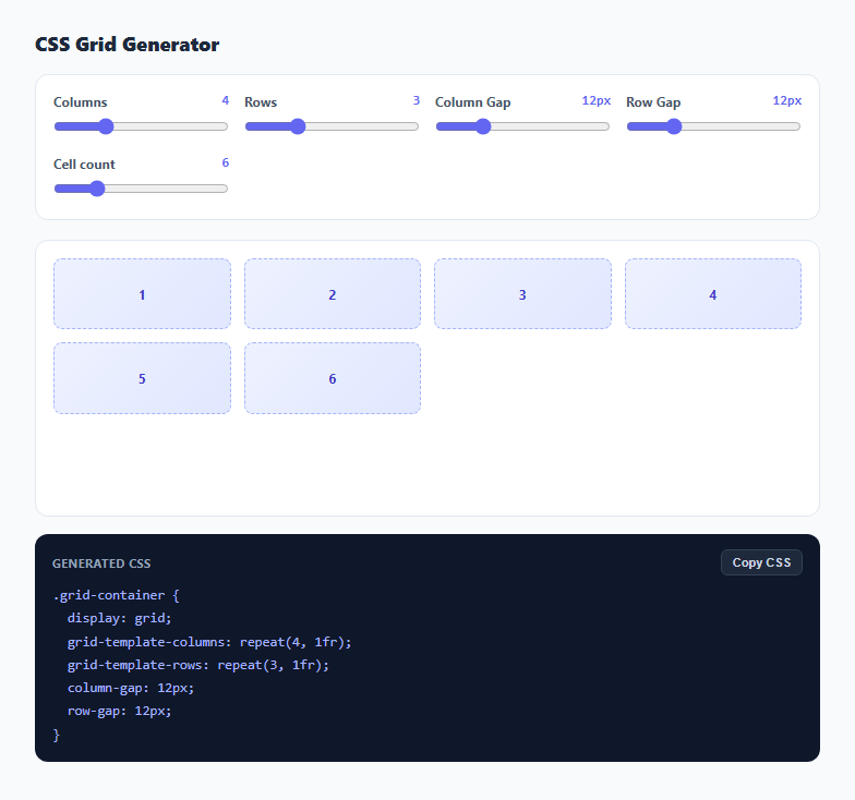
CSS Grid is one of the most powerful layout systems in modern CSS, but the property names are easy to mix up under deadline pressure — is it column-gap or grid-column-gap, and does repeat(4, 1fr) belong in grid-template-columns or grid-template-areas? This snippet turns grid construction into direct manipulation: five sliders control column count, row count, column gap, row gap, and how many placeholder cells to render, and every change instantly updates both a live visual preview and the exact CSS block you would paste into a stylesheet.
Driving a real grid container with live style properties
The preview element is a real display: grid container, not a simulation. render() reads each slider's current value and writes directly to gridPreview.style.gridTemplateColumns, gridTemplateRows, columnGap, and rowGap using the browser's own CSS Grid engine. This matters because it means the preview behaves exactly as a real grid would with the same properties — including how the browser handles more or fewer cells than the row/column count implies, letting you directly observe CSS Grid's implicit row creation when the cell count exceeds rows × columns.
Populating placeholder cells
A separate slider controls how many numbered placeholder .grid-cell divs get appended into the preview container, independent of the row and column count sliders. This is deliberate: seeing what happens when you have 10 cells in a 4-column, 2-row layout (which only accounts for 8 explicit cells) demonstrates CSS Grid's auto-placement behavior — the extra two cells flow into an implicitly created third row — without needing to explain the concept in the abstract. Dragging the cell-count slider past the explicit grid size is itself the best explanation of implicit rows.
Building the copyable CSS output as a string
render() also assembles a formatted CSS block as a plain string using repeat(N, 1fr) for both grid-template-columns and grid-template-rows, and separate column-gap/row-gap declarations rather than the shorthand gap property — this is intentional, since writing them separately makes it immediately clear which slider maps to which line when a user is learning the syntax, even though a production stylesheet would typically collapse them into a single gap: 12px 12px line. The repeat() function is used instead of listing out 1fr 1fr 1fr 1fr explicitly, matching how experienced developers actually write grid templates for anything beyond two or three tracks.
One-click copy to clipboard
The Copy CSS button uses navigator.clipboard.writeText() to copy the exact generated CSS block, with a temporary "Copied!" label and green highlight for confirmation, and a safe fallback that still shows the confirmation state if the Clipboard API is unavailable in a restricted context like a sandboxed iframe.
Why sliders instead of text inputs
Text inputs for grid dimensions invite invalid states — negative numbers, non-numeric text, or absurdly large values that would freeze the browser rendering thousands of cells. Range sliders constrain the input space to sensible bounds (1-12 columns, 1-8 rows, 0-48px gaps, 1-24 cells) while still updating live on every drag, which keeps the tool fast and impossible to break through bad input, and keeps the generated CSS always syntactically valid no matter what the user does.
Build with AI
Build, Understand, Optimize, and Extend It With AI
Paste this snippet into an AI assistant like Claude and ask it to explain exactly how CSS Grid's implicit row auto-placement algorithm decides where extra cells land when the cell count exceeds rows times columns — dragging the cell slider is a great way to build intuition, and an AI assistant can fill in the specification details behind what you are seeing. It is also a solid base to extend: ask for a toggle between repeat(N, 1fr) and named grid-template-areas mode, support for mixed fixed and flexible track sizes per column, or a "randomize" button that spans some cells across multiple grid tracks using grid-column and grid-row.
Prompt to recreate it
Copy this into your AI assistant of choice to build the effect from scratch, or as a jumping-off point for your own variant:
Build a visual CSS Grid layout generator in plain HTML, CSS, and JavaScript, no libraries.

Requirements:
- Range sliders for: number of grid columns (1-12), number of grid rows (1-8), column gap in pixels (0-48), row gap in pixels (0-48), and a separate slider for how many placeholder cells to render (1-24, independent of rows times columns).
- A live preview area that is an actual display: grid container, with its gridTemplateColumns, gridTemplateRows, columnGap, and rowGap style properties set directly from the slider values on every input event — not a simulated or hand-drawn grid.
- Numbered placeholder cells filling the preview grid according to the cell-count slider, so that setting more cells than rows times columns visibly demonstrates CSS Grid's implicit row auto-placement.
- A read-only output panel showing the exact generated CSS for a .grid-container class, using repeat(N, 1fr) for the template columns and rows and separate column-gap/row-gap declarations, updating live alongside the preview.
- A "Copy CSS" button that copies the generated CSS block to the clipboard using the Clipboard API, with a brief visual confirmation, and a safe fallback if the Clipboard API is unavailable.
Want to tighten it up first? Run this prompt through the AI Prompt Studio to score it across 8 quality dimensions, catch anti-patterns, and tune the wording for Claude, ChatGPT, or Gemini before you paste it in.
Step by step
How to Use
- 1Drag the Columns and Rows slidersSet the number of explicit grid tracks. The preview grid updates its column/row structure in real time.
- 2Adjust Column Gap and Row GapControl the spacing between grid tracks independently — useful for asymmetric layouts like a tight column gap with a looser row gap.
- 3Change the Cell countAdd more placeholder cells than rows × columns to see CSS Grid create implicit rows automatically.
- 4Read the generated CSSThe dark panel always shows the exact grid-template-columns, grid-template-rows, column-gap, and row-gap declarations for the current settings.
- 5Copy the CSSClick "Copy CSS" to copy the block to your clipboard, ready to paste into your stylesheet on a .grid-container class.
- 6Export in your formatClick HTML for a standalone file, JSX for a React component, or Tailwind for a React + Tailwind version.
Real-world uses
Common Use Cases
Got questions?
Frequently Asked Questions
It is a real display: grid container. The sliders write directly to gridTemplateColumns, gridTemplateRows, columnGap, and rowGap on the actual DOM element, so the preview behaves exactly like CSS Grid does in any browser, including auto-placement behavior.
CSS Grid automatically creates additional implicit rows to fit the extra cells, following the standard auto-placement algorithm. This is a genuine, useful way to see implicit row creation happen live rather than reading about it.
Writing them separately in the generated CSS makes the mapping from each slider to its corresponding CSS line unambiguous, which is especially helpful while learning the syntax. You can always manually collapse them into a single gap: <row> <column>; declaration afterward.
No, the generator focuses on the repeat(N, 1fr) track-based approach, which covers the majority of common grid layouts. Named template areas are a separate, more advanced CSS Grid feature not covered by the sliders here.
Yes, by design: columns are capped at 12, rows at 8, gaps at 48px, and cells at 24. These bounds keep the preview fast and the generated CSS always sensible; edit the min/max attributes on the range inputs in the HTML panel to raise them.
Not directly from the sliders, which always generate equal-width repeat(N, 1fr) tracks. Copy the generated CSS and manually edit individual track sizes (e.g. replacing one 1fr with 200px) for mixed fixed/flexible layouts.