Learn Coding Visually
Learn to code with interactive, live-preview playgrounds — HTML, CSS, JavaScript, React & more.
 HTML Playground42 lessons · Click-based · Live preview
 CSS PlaygroundLearn CSS with a live editor
 JavaScript Playground60 lessons · DOM · Async · Canvas
 React PlaygroundLearn React with a live code editor
 GSAP PlaygroundLearn GSAP animation interactively
 SVG Playground44 lessons · shapes · paths · animation
 SCSS Playground45 lessons · Sass modules · tokens
 Tailwind PlaygroundLearn Tailwind CSS with a live editor
 Bootstrap 5 Playground50 lessons · live preview
Boarding Pass Card — Free HTML CSS Snippet
Boarding Pass · Cards · Plain HTML & CSS · Live preview
What's included
Features
About this UI Snippet
Boarding Pass — Flight Route, Perforated Tear-Off Stub & CSS Barcode
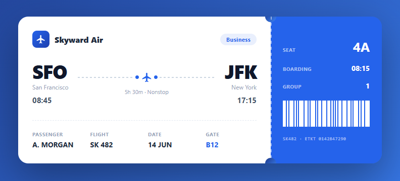
A boarding pass card is a high-craft UI piece that appears in travel apps, flight booking confirmations, event tickets, and design portfolios. This snippet recreates a realistic airline boarding pass entirely in HTML and CSS: an airline header, a departure-to-arrival route with an animated flight path, passenger and flight details, and a colour-contrasting tear-off stub with a pure-CSS barcode and notched perforation.
The two-part ticket structure
The pass is a flex container split into a white main section and a coloured stub. This mirrors a real boarding pass where the stub is the part torn off and retained at the gate. On narrow screens, a media query stacks the two parts vertically and rotates the perforation to a horizontal tear line — a thoughtful responsive adaptation that keeps the ticket metaphor intact.
The perforated tear edge
The perforation between the two parts is built from a repeating-linear-gradient that creates a dashed dotted line, plus two circular notches punched into the top and bottom of the seam using ::before and ::after pseudo-elements coloured to match the page background. These notches are the visual signature of a tear-off ticket — the same technique used for the gift card and other coupon designs.
The flight route visualisation
The route shows large three-letter airport codes (SFO, JFK), city names, and times. Between them, a flight path uses a dashed repeating-gradient line with a plane icon centred and a dot at each end. The dashed line evokes a flight trajectory on a map, and the plane sits at the midpoint pointing toward the destination.
The pure-CSS barcode
The barcode is a row of span elements with varying flex widths driven by nth-child selectors (every 2nd, 3rd, and 5th bar gets a different width). This produces an irregular, realistic barcode pattern without any image or library. It is decorative here, but in production you would replace it with a real scannable code from the QR code generator.
Typography and detail hierarchy
The design uses a clear hierarchy: oversized airport codes anchor the eye, uppercase micro-labels (Passenger, Flight, Gate) sit above their values, and the gate number is highlighted in the brand blue. font-weight and size contrast carry the information architecture, a technique that makes dense ticket data scannable at a glance.
Build with AI
Build, Understand, Optimize, and Extend It With AI
You don't have to reverse-engineer the notch-and-perforation trick by squinting at the CSS. Paste this snippet's HTML and CSS into an AI coding assistant like Claude and ask it to explain exactly how the pass-stub::before and ::after pseudo-elements combine with the repeating-linear-gradient perforation to fake a torn ticket edge, or why those notches are filled with the page background color rather than white. The same assistant can help optimize it — asking whether the four separate nth-child rules driving the barcode's flex widths could be generated procedurally instead of hardcoded, or how to keep the layout stable if the airport code text is much longer. It's also a good way to extend the design: ask it to wire in a real scannable barcode or QR code, animate the plane icon along the dashed path, or add a boarding-status state that changes the stub color. Treat the code less like a finished artifact and more like a starting point for a conversation.
Prompt to recreate it
Copy this into your AI assistant of choice to build the effect from scratch, or as a jumping-off point for your own variant:
Build an airline "boarding pass" card in plain HTML and CSS only, no JavaScript, no images, no icon fonts.

Requirements:
- A two-part ticket: a wider white main section and a narrower colored stub, laid out side by side with flexbox, that stack vertically on narrow screens via a media query.
- A perforated seam between the two parts made from a repeating-linear-gradient that produces a dashed line, plus two circular pseudo-elements (::before and ::after) positioned half outside the seam edge and filled with the page's background color, so they read as punched-out notches rather than solid circles.
- When the layout stacks vertically on mobile, the perforation must rotate from a vertical dashed line to a horizontal one, and the two notch circles must reposition to the top-left and top-right corners of the new seam instead of top and bottom.
- A route section showing large origin and destination airport codes, city names, and times, connected by a dashed flight-path line built with repeating-linear-gradient on a pseudo-element, with a small icon centered on the path and a dot at each end.
- A details grid below the route showing passenger name, flight number, date, and a visually highlighted gate value in a different color than the other fields.
- On the stub: a large seat number, boarding time, group number, and a fake barcode made from a row of plain span elements whose widths vary using nth-child selectors (so every second, third, and fifth bar has a different flex width) to look like an irregular real barcode without any image or canvas.
Want to tighten it up first? Run this prompt through the AI Prompt Studio to score it across 8 quality dimensions, catch anti-patterns, and tune the wording for Claude, ChatGPT, or Gemini before you paste it in.
Step by step
How to Use
- 1Update the flight detailsEdit the airport codes (SFO, JFK), city names, departure and arrival times, and the duration text to match your flight.
- 2Set passenger and gate infoChange the Passenger name, Flight number, Date, and Gate in the details grid. The gate uses a highlighted blue style to draw attention.
- 3Edit the stubUpdate the Seat, Boarding time, and Group on the coloured stub. The seat number uses an oversized style as the most important stub value.
- 4Brand the passChange the airline name and logo, and recolour the stub and accents by editing the brand blue values. The gradient page background can match your brand too.
- 5Add a real barcodeReplace the decorative CSS barcode with a real one — generate a Code128 or QR code from the ticket number using a library like JsBarcode or qrcode, and insert the resulting image or canvas in place of the span bars.
- 6Export for your frameworkClick "JSX" for a React component that accepts a flight prop object. Click "Vue" for a Vue 3 SFC. Click "Tailwind" for a React + Tailwind version.
Real-world uses
Common Use Cases
Got questions?
Frequently Asked Questions
Two techniques combine. The dashed line down the seam is a repeating-linear-gradient that alternates a visible colour and transparent every few pixels, producing a dotted perforation. The circular notches at the top and bottom of the seam are ::before and ::after pseudo-elements on the stub: each is a circle (border-radius: 50%) positioned half-off the left edge and filled with the same colour as the page background, so they read as holes punched into the ticket. Together they recreate the look of a real tear-off stub.
It is decorative — a row of span bars with varying widths set by nth-child rules to look like a real barcode without any image. For a scannable boarding pass, replace it with a genuine code generated from the ticket data: use JsBarcode for a Code128 barcode or the qrcode library for a QR code, rendering to a canvas or SVG. Airlines typically use the Aztec or PDF417 2D formats for boarding passes, which encode the full IATA BCBP data string.
A media query at 560px switches the flex direction from row to column, so the stub drops below the main section instead of sitting beside it. The perforation, originally a vertical line, is rotated to a horizontal repeating-gradient across the new seam, and the two circular notches are repositioned to the left and right of the top edge. This keeps the tear-off ticket metaphor intact on narrow screens where a side-by-side layout would be too cramped.
Accept a flight prop object: { airline, class, from: {code, city, time}, to: {code, city, time}, duration, passenger, flightNo, date, gate, seat, boarding, group, ticketNo }. Render the static markup from those values. For a real barcode, render a Barcode component (from react-barcode or similar) passing the ticket number. Generate Wallet passes server-side and offer Add to Wallet buttons alongside the visual card.