Source Code
<div class="scene">
  <div class="card">
    <div class="card-top">
      <div class="date-box">
        <span class="month">JUN</span>
        <span class="day">24</span>
      </div>
      <div class="category-badge">Design</div>
    </div>
    <div class="card-body">
      <h3>Frontend Design Summit 2026</h3>
      <div class="details">
        <div class="detail">
          <svg width="13" height="13" viewBox="0 0 24 24" fill="none" stroke="currentColor" stroke-width="2" stroke-linecap="round"><circle cx="12" cy="12" r="10"/><polyline points="12 6 12 12 16 14"/></svg>
          9:00 AM – 5:00 PM PST
        </div>
        <div class="detail">
          <svg width="13" height="13" viewBox="0 0 24 24" fill="none" stroke="currentColor" stroke-width="2" stroke-linecap="round"><path d="M21 10c0 7-9 13-9 13s-9-6-9-13a9 9 0 0 1 18 0z"/><circle cx="12" cy="10" r="3"/></svg>
          San Francisco, CA
        </div>
      </div>
      <div class="attendees">
        <div class="avs">
          <span style="background:#6366f1">A</span>
          <span style="background:#8b5cf6">B</span>
          <span style="background:#ec4899">C</span>
          <span style="background:#0ea5e9">D</span>
        </div>
        <span class="av-count">+248 attending</span>
      </div>
    </div>
    <div class="card-footer">
      <div class="price">$49 <span>/ ticket</span></div>
      <button class="rsvp-btn" onclick="this.textContent=this.textContent==='RSVP Now'?'✓ Reserved':'RSVP Now';this.classList.toggle('reserved')">RSVP Now</button>
    </div>
  </div>
</div>
* { box-sizing: border-box; margin: 0; padding: 0; }
body { font-family: system-ui, sans-serif; background: #f1f5f9; display: flex; align-items: center; justify-content: center; min-height: 100vh; padding: 20px; }
.card { background: #fff; border-radius: 18px; overflow: hidden; width: 300px; box-shadow: 0 4px 24px rgba(0,0,0,0.08); }
.card-top { background: linear-gradient(135deg,#6366f1,#8b5cf6); padding: 20px; display: flex; justify-content: space-between; align-items: flex-start; }
.date-box { display: flex; flex-direction: column; align-items: center; background: rgba(255,255,255,0.2); border-radius: 10px; padding: 10px 16px; backdrop-filter: blur(8px); }
.month { font-size: 11px; font-weight: 700; color: rgba(255,255,255,0.8); text-transform: uppercase; letter-spacing: 1px; }
.day { font-size: 28px; font-weight: 800; color: #fff; line-height: 1.1; }
.category-badge { background: rgba(255,255,255,0.2); color: #fff; font-size: 11px; font-weight: 700; padding: 4px 10px; border-radius: 20px; backdrop-filter: blur(8px); }
.card-body { padding: 18px; display: flex; flex-direction: column; gap: 12px; }
h3 { font-size: 15px; font-weight: 700; color: #1e293b; line-height: 1.4; }
.details { display: flex; flex-direction: column; gap: 6px; }
.detail { display: flex; align-items: center; gap: 6px; font-size: 12px; color: #64748b; }
.attendees { display: flex; align-items: center; gap: 8px; }
.avs { display: flex; }
.avs span { width: 26px; height: 26px; border-radius: 50%; display: flex; align-items: center; justify-content: center; font-size: 10px; font-weight: 700; color: #fff; margin-left: -6px; border: 2px solid #fff; }
.avs span:first-child { margin-left: 0; }
.av-count { font-size: 12px; color: #64748b; font-weight: 500; }
.card-footer { display: flex; align-items: center; justify-content: space-between; padding: 14px 18px; border-top: 1px solid #f1f5f9; }
.price { font-size: 18px; font-weight: 800; color: #1e293b; }
.price span { font-size: 12px; color: #94a3b8; font-weight: 400; }
.rsvp-btn { padding: 8px 18px; background: #6366f1; color: #fff; border: none; border-radius: 8px; font-size: 13px; font-weight: 600; cursor: pointer; font-family: inherit; transition: all 0.15s; }
.rsvp-btn:hover { background: #4f46e5; }
.rsvp-btn.reserved { background: #16a34a; }Learn Coding Visually
Learn to code with interactive, live-preview playgrounds — HTML, CSS, JavaScript, React & more.
 HTML Playground42 lessons · Click-based · Live preview
 CSS PlaygroundLearn CSS with a live editor
 JavaScript Playground60 lessons · DOM · Async · Canvas
 React PlaygroundLearn React with a live code editor
 GSAP PlaygroundLearn GSAP animation interactively
 SVG Playground44 lessons · shapes · paths · animation
 SCSS Playground45 lessons · Sass modules · tokens
 Tailwind PlaygroundLearn Tailwind CSS with a live editor
 Bootstrap 5 Playground50 lessons · live preview
Event Card — Free HTML CSS Snippet
Event Card · Cards · Plain HTML & CSS · Live preview
What's included
Features
About this UI Snippet
Event Card — Gradient Header, Date Badge & Overlapping Avatar Stack
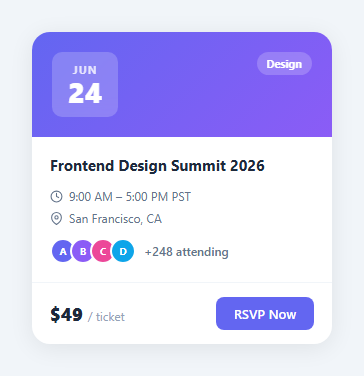
An event card displays all key information about an upcoming event — date, time, location, attendees, and an RSVP / add-to-calendar action. Used in event platforms, community apps, calendar widgets, and conference landing pages.
The date badge
The gradient header contains a .date-box with position: absolute — a white semi-transparent badge showing the day number large and month small in a flex column. The header gradient provides the visual background for the date.
Overlapping [avatar stack](/ui-snippets/avatar-group/)
Each attendee avatar has margin-left: -8px and border: 2px solid #fff — the negative margin creates the overlapping effect while the white border separates each circle. A +N text element follows the last avatar.
Metadata row
Location and time are displayed in a flex row with icon + text pairs, using a coloured emoji icon for visual scanning speed.
RSVP state management
The RSVP button toggles between two states: "RSVP" (outline style) and "✓ Going" (filled green). A click handler toggles a .going class on the button, which changes the background, border, and text via CSS. The attendee count updates simultaneously to reflect the new registration. This is the optimistic update pattern — update the UI immediately, then sync with the API.
The gradient header
The card header uses background: linear-gradient with an overlay pattern. The gradient provides visual interest for the date badge and event image placeholder. Replace the gradient with a real event cover image: background: url("event.jpg") center/cover — the date badge positions correctly over any background due to its absolute positioning and semi-transparent white background.
The capacity indicator
A small capacity bar below the attendee row shows percentage-full status. If an event is nearly full, this visual cue creates urgency. The bar uses the same width percentage technique as progress bars: width: capacityPct + "%".
Accessibility for the date badge
The date information is visually clear in the badge but should also be available to screen readers as text inside the card. Include an aria-label on the card or a visually hidden <time> element with datetime="2026-06-15" so assistive technology can announce the event date correctly.
Combining multiple event cards
For an events listing page, render event cards in a CSS grid: display: grid; grid-template-columns: repeat(auto-fill, minmax(300px, 1fr)); gap: 20px. Each card is self-contained and the grid automatically adapts from 3 columns on desktop to 1 on mobile. Add a filter row above for category chips (Music, Tech, Sports) that filter the displayed cards using the same .hidden class pattern as the gallery category filter.
Build with AI
Build, Understand, Optimize, and Extend It With AI
You don't have to eyeball the avatar stack to understand it. Paste this snippet's HTML, CSS, and JS into an AI coding assistant like Claude and ask it to explain exactly how the negative margin-left combined with the white border on each attendee avatar produces the overlapping-circle effect, and why the border is necessary for the overlap to read cleanly rather than as a blob of merged colors. The same assistant can help optimize it — ask whether the RSVP button's inline onclick handler that swaps textContent and toggles a class should be replaced with a proper state-driven approach once this card is wired to a real booking API, and what happens visually if the attendee count needs to update at the same time. It's also useful for extending the card: ask it to add a sold-out or cancelled ribbon state, a capacity progress bar beneath the attendee row, or a countdown showing days remaining until the event date. Treat the code less like a finished artifact and more like a starting point for a conversation.
Prompt to recreate it
Copy this into your AI assistant of choice to build the effect from scratch, or as a jumping-off point for your own variant:
Build an event card component in plain HTML, CSS, and a small amount of JavaScript — no library.

Requirements:
- A card with a gradient header section containing an absolutely-positioned date badge (month abbreviation small on top, day number large beneath it) with a semi-transparent white background so it stays legible over any gradient or photo, and a category badge in the opposite corner using the same translucent style.
- A body section with an event title, a metadata list of icon-plus-text rows for time and location, and an overlapping row of attendee avatar circles.
- Build the overlapping avatar effect using a negative left margin on every avatar after the first, combined with a solid border matching the card's background color on every avatar, so overlapping circles read as distinct people rather than a merged shape.
- After the visible avatars, show a "+N attending" text count reflecting attendees beyond what's rendered as circles.
- A footer row with the ticket price on one side and an RSVP button on the other; clicking the button must toggle between an unreserved and a reserved visual state (different background color and label text) using a single class toggle, with no page reload.
- Ensure the card's outer container clips the gradient header's corners with overflow hidden so the rounded corners apply consistently to the header and the rest of the card.
- Make the date, title, location, time, and attendee data trivially swappable so the same card structure works for any event without CSS changes.
Want to tighten it up first? Run this prompt through the AI Prompt Studio to score it across 8 quality dimensions, catch anti-patterns, and tune the wording for Claude, ChatGPT, or Gemini before you paste it in.
Step by step
How to Use
- 1Load the snippetClick "Event Card" in the sidebar. The preview shows the card with gradient header, date badge, attendee stack, and RSVP button.
- 2Update event detailsIn the HTML panel, change the date numbers, month, event title, location, time, and description.
- 3Update attendee avatarsChange the avatar initials and background colours in the .attendee divs.
- 4Change the gradientUpdate the linear-gradient on .card-top in the CSS panel to match your event brand.
- 5Change the RSVP buttonUpdate the button text and add a JS click handler for the RSVP action.
- 6Export in your formatClick "HTML" for a standalone file, "JSX" for a React component, or "Tailwind" for a React + Tailwind version.
Real-world uses
Common Use Cases
Got questions?
Frequently Asked Questions
The .card-top header has position: relative. The .date-box has position: absolute; top: 16px; right: 20px — placed in the top-right corner of the gradient. The semi-transparent white background (rgba(255,255,255,0.2)) makes it readable over any gradient colour while maintaining the translucent aesthetic.
Each .attendee div has margin-left: -8px (except the first which has margin-left: 0). This pulls each avatar 8px under the previous one, creating the overlap. border: 2px solid #fff creates a white gap between overlapping circles, giving each one visual separation.
Copy an .attendee div, update the initials and background-color, and paste it before the +N count element. Update the +N number to reflect the total attendees beyond what is shown. Keep 3-4 visible avatars — showing more than 4 looks cluttered on a compact card.
Add href to the button's anchor or an onclick that calls your booking API: btn.onclick = () => fetch("/api/rsvp", { method: "POST", body: JSON.stringify({ eventId }) }). After successful RSVP, change the button text to Registered ✓ and update its style with a green outline instead of a filled background.
Add a .sold-out or .cancelled class to .card. Override RSVP button: disabled with opacity: 0.5 and changed text. For cancelled events, add a banner at the top of the card: position: absolute; top: 0; left: 0; right: 0; background: #ef4444; color: #fff; text-align: center; padding: 4px; font-size: 12px; font-weight: 700.
Yes. Create an EventCard component accepting event, attendees, and isRegistered props. Derive the card content from props: the gradient from event.colour, date from event.date, title from event.name. Map attendees array to avatar elements. Wire the RSVP button to an onRSVP callback prop.