


Learn Coding Visually
Learn to code with interactive, live-preview playgrounds — HTML, CSS, JavaScript, React & more.
 HTML Playground42 lessons · Click-based · Live preview
 CSS PlaygroundLearn CSS with a live editor
 JavaScript Playground60 lessons · DOM · Async · Canvas
 React PlaygroundLearn React with a live code editor
 GSAP PlaygroundLearn GSAP animation interactively
 SVG Playground44 lessons · shapes · paths · animation
 SCSS Playground45 lessons · Sass modules · tokens
 Tailwind PlaygroundLearn Tailwind CSS with a live editor
 Bootstrap 5 Playground50 lessons · live preview
Countdown-Ring Carousel — HTML CSS JS Snippet
Countdown-Ring Carousel · Heroes · Plain HTML, CSS & JS · Live preview
What's included
Features
About this UI Snippet
Countdown-Ring Carousel — An SVG Stroke as a Literal Timer
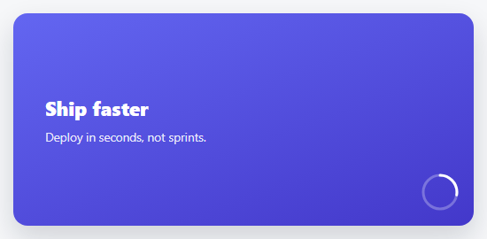
Instead of a linear progress bar, this carousel's autoplay timer is a small circular ring in the corner that drains like an actual countdown — because it's driven by exactly the same trick real progress rings use: an SVG circle with stroke-dasharray set to its own circumference, and stroke-dashoffset animated from 0 up to that same circumference to make the visible stroke shrink away.
requestAnimationFrame instead of a CSS transition
Unlike a bar carousel where a CSS width transition can do all the work, this ring needs to be *readable mid-drain* if a user hovers to pause — so the fill is driven by requestAnimationFrame, computing progress = elapsed / DURATION on every frame from a real performance.now() timestamp, not from a fire-and-forget transition. That's what makes an accurate pause possible: the loop just stops updating strokeDashoffset the instant paused becomes true, freezing the ring at its exact current drain state.
The circumference constant, and why it can't be a guess
stroke-dasharray and the dashoffset math both use 119.4 — the circle's actual circumference, 2 × π × r for a radius of 19. Get this number wrong and the ring either shows a gap at rest (dasharray too large) or never fully hides its stroke (too small); it has to match the SVG circle's real r attribute exactly.
A clickable timer, not just a display
The ring itself is a click target that calls next() directly — letting an impatient visitor skip ahead without hunting for separate arrow buttons, while the ring's decorative countdown role and its functional skip role stay the same element.
Build with AI
Build, Understand, Optimize, and Extend It With AI
Paste this snippet's HTML, CSS, and JS into an AI coding assistant like Claude and ask it to explain exactly how stroke-dasharray and stroke-dashoffset combine to make an SVG circle appear to drain, and why the 119.4 circumference constant has to match the circle's actual radius precisely. It's also worth asking the assistant to add a numeric countdown label inside the ring showing seconds remaining, or to convert the ring into a proper accessible button with an aria-label and prefers-reduced-motion handling that disables autoplay entirely for users who've requested reduced motion.
Prompt to recreate it
Copy this into your AI assistant of choice to build the effect from scratch, or as a jumping-off point for your own variant:
Build a hero carousel in plain HTML, CSS, and vanilla JavaScript with a small circular SVG countdown ring (not a linear bar) that visibly drains to time each slide's autoplay duration — no library.

Requirements:
- Several full-bleed hero slides stacked on top of each other, crossfading via opacity, only one active at a time.
- A small SVG circle positioned in a corner of the carousel, using the stroke-dasharray/stroke-dashoffset technique to visually represent a countdown: at the start of each slide's timer the ring shows a full stroke, and it visually drains away (the stroke shrinking) as time elapses, reaching a fully empty stroke exactly when the slide's time is up.
- The countdown must be driven by requestAnimationFrame using real timestamps (not a CSS transition and not a fixed-interval setInterval), calculating elapsed time on every frame and deriving the stroke-dashoffset from that elapsed time divided by the total duration.
- When the ring finishes draining, automatically advance to the next slide (wrapping to the first after the last) and restart the ring's drain from full.
- On mouse hover over the carousel, the ring's drain must freeze at its exact current position rather than continuing or resetting.
- On mouse leave, the ring must resume draining smoothly from that exact frozen position toward empty, correctly timed so it still completes the full original duration relative to when the countdown actually began.
- The ring itself must be directly clickable, immediately advancing to the next slide and resetting the ring to a full stroke when clicked.
- The circle's stroke-dasharray value must be calculated from and match the circle's actual radius (2 × π × radius), not an arbitrary approximation.
Want to tighten it up first? Run this prompt through the AI Prompt Studio to score it across 8 quality dimensions, catch anti-patterns, and tune the wording for Claude, ChatGPT, or Gemini before you paste it in.
Source Code
<div class="crc-wrap" id="crcWrap">
  <div class="crc-track" id="crcTrack">
    <div class="crc-slide" style="background:linear-gradient(160deg,#6366f1,#4338ca)"><h2>Ship faster</h2><p>Deploy in seconds, not sprints.</p></div>
    <div class="crc-slide" style="background:linear-gradient(160deg,#ec4899,#9d174d)"><h2>Stay in sync</h2><p>Real-time collaboration, built in.</p></div>
    <div class="crc-slide" style="background:linear-gradient(160deg,#10b981,#047857)"><h2>Scale freely</h2><p>Infra that grows without a rewrite.</p></div>
  </div>
  <svg class="crc-ring" viewBox="0 0 44 44" width="44" height="44">
    <circle class="crc-track-circle" cx="22" cy="22" r="19"></circle>
    <circle class="crc-fill-circle" id="crcFillCircle" cx="22" cy="22" r="19"></circle>
  </svg>
</div>*{box-sizing:border-box;margin:0;padding:0}
body{font-family:system-ui,-apple-system,sans-serif;background:#f6f7f9;min-height:100vh;display:flex;align-items:center;justify-content:center;padding:24px}
.crc-wrap{position:relative;width:100%;max-width:520px;height:240px;border-radius:16px;overflow:hidden;box-shadow:0 14px 32px rgba(15,23,42,.16)}
.crc-track{position:relative;width:100%;height:100%}
.crc-slide{position:absolute;inset:0;display:flex;flex-direction:column;justify-content:center;padding:36px;opacity:0;transition:opacity .5s ease}
.crc-slide.active{opacity:1;z-index:1}
.crc-slide h2{color:#fff;font-size:22px;font-weight:800;margin-bottom:8px}
.crc-slide p{color:rgba(255,255,255,.88);font-size:13.5px}
.crc-ring{position:absolute;bottom:16px;right:16px;transform:rotate(-90deg);cursor:pointer;z-index:3}
.crc-track-circle{fill:none;stroke:rgba(255,255,255,.28);stroke-width:3}
.crc-fill-circle{fill:none;stroke:#fff;stroke-width:3;stroke-linecap:round;stroke-dasharray:119.4;stroke-dashoffset:119.4}var slides = document.querySelectorAll('.crc-slide');
var wrap = document.getElementById('crcWrap');
var fillCircle = document.getElementById('crcFillCircle');
var CIRC = 119.4; // 2 * PI * r(19)
var DURATION = 4000;
var current = 0;
var paused = false;
var startTime = null;
var rafId = null;
function render() {
slides.forEach(function (s, i) { s.classList.toggle('active', i === current); });
}
function next() { current = (current + 1) % slides.length; render(); startRing(); }
function startRing() {
cancelAnimationFrame(rafId);
startTime = performance.now();
tick();
}
function tick(now) {
if (paused) { rafId = requestAnimationFrame(tick); return; }
now = now || performance.now();
var elapsed = now - startTime;
var progress = Math.min(1, elapsed / DURATION);
fillCircle.style.strokeDashoffset = CIRC * (1 - progress);
if (progress >= 1) { next(); return; }
rafId = requestAnimationFrame(tick);
}
wrap.addEventListener('mouseenter', function () { paused = true; });
wrap.addEventListener('mouseleave', function () {
if (paused) {
var offset = parseFloat(fillCircle.style.strokeDashoffset || CIRC);
var progress = 1 - offset / CIRC;
startTime = performance.now() - progress * DURATION;
}
paused = false;
});
document.querySelector('.crc-ring').addEventListener('click', function () { next(); });
render();
startRing();Step by step
How to Use
- 1Paste HTML, CSS, and JSA hero carousel starts playing, with a small ring in the corner beginning to drain.
- 2Watch the ring drainWhen it empties completely, the hero crossfades to the next slide and the ring refills.
- 3Hover over the heroThe ring freezes exactly where it is — the countdown pauses mid-drain.
- 4Move the mouse awayThe ring resumes draining from that exact frozen point, not from full again.
- 5Click the ringSkip straight to the next slide immediately, resetting the ring to full.
Real-world uses
Common Use Cases
Got questions?
Frequently Asked Questions
Change the DURATION constant (milliseconds) — it drives both how long the ring takes to drain and when auto-advance fires, since both come from the same elapsed/DURATION calculation.
Change the SVG's width/height and the circle's r attribute together, then recalculate CIRC as 2 * Math.PI * r and update both stroke-dasharray in the CSS and the CIRC constant in the JS to match — they must agree exactly or the ring will show a gap or never fully empty.
A CSS transition can't be queried mid-flight for a precise "how much progress was made" value in every browser reliably — requestAnimationFrame with a real timestamp gives an exact, readable progress value at any instant, which the pause/resume logic depends on.
Yes — next() uses modulo against slides.length, so any number of .crc-slide elements works without other changes.
The ring is a real clickable element with cursor: pointer; for full accessibility, convert it to a <button> wrapping the SVG with an aria-label like "Skip to next slide," and add prefers-reduced-motion handling to disable autoplay for users who've requested it.