You Might Also Like
Learn Coding Visually
Learn to code with interactive, live-preview playgrounds — HTML, CSS, JavaScript, React & more.
 HTML Playground42 lessons · Click-based · Live preview
 CSS PlaygroundLearn CSS with a live editor
 JavaScript Playground60 lessons · DOM · Async · Canvas
 React PlaygroundLearn React with a live code editor
 GSAP PlaygroundLearn GSAP animation interactively
 SVG Playground44 lessons · shapes · paths · animation
 SCSS Playground45 lessons · Sass modules · tokens
 Tailwind PlaygroundLearn Tailwind CSS with a live editor
 Bootstrap 5 Playground50 lessons · live preview
Keyboard-Navigable Icon Rail — Free HTML CSS JS Snippet
Keyboard-Navigable Icon Rail · Navigation · Plain HTML, CSS & JS · Live preview
What's included
Features
About this UI Snippet
Keyboard-Navigable Icon Rail — Roving Tabindex, Arrow Key Navigation & ARIA Toolbar Pattern
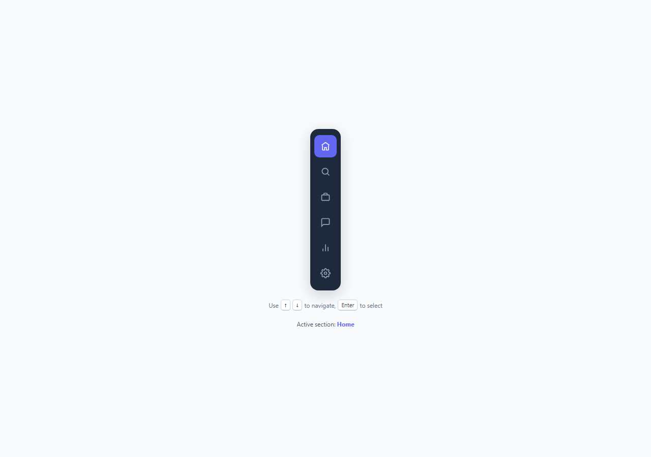
Icon-only navigation rails are everywhere in 2026 product design — Linear, Figma, Notion, and most modern SaaS dashboards collapse primary navigation into a slim vertical strip of icons to maximize canvas space. The visual pattern is easy to copy; the accessibility pattern behind it almost never is. This snippet implements the icon rail exactly as the WAI-ARIA Authoring Practices Guide specifies for a toolbar or single-select navigation widget: roving tabindex, not a flat list of independently tabbable buttons.
Why roving tabindex instead of plain Tab order
The naive implementation gives every icon button its own place in the page's Tab order, so a keyboard user has to press Tab six separate times just to get past the sidebar before reaching page content — a real and common source of keyboard-only user frustration. The roving tabindex pattern solves this by keeping exactly one item in the natural Tab sequence at any moment (tabindex="0") while every other item is removed from it (tabindex="-1", meaning "focusable via script, not via Tab"). Tab into the rail once, and the browser lands on whichever item currently holds tabindex="0" — by default, the active item. From there, Arrow Up and Arrow Down move focus *within* the rail without ever touching the page's Tab order, and pressing Tab again exits the rail entirely and moves to the next focusable region of the page. This is the same interaction model used by native OS toolbars, browser tab strips, and radio-button groups, and it's codified in the ARIA APG's "Navigation" and "Toolbar" patterns.
How the JavaScript keeps state in sync
Two separate indices are tracked: focusIndex, which item currently owns tabindex="0" (keyboard focus position), and activeIndex, which item is the "selected" page (aria-current="page"). These are deliberately distinct — a sighted keyboard user should be able to arrow through the rail to preview items without those arrow presses actually navigating anywhere, exactly like arrowing through a native <select> doesn't submit a form until you commit. setRovingTabindex() flips tabindex from the old focus item to the new one and calls .focus(), while selectItem() is only called on Enter, Space, or a mouse click, moving the aria-current="page" attribute (and its accompanying purple background style) to the newly committed item. Home and End keys jump focus to the first and last item respectively, matching the APG spec for composite widgets.
Discoverability: the on-screen hint
A hidden interaction pattern is a broken interaction pattern for most users. This is why the demo includes a small, permanently visible hint row — "Use ↑ ↓ to navigate, Enter to select" — rendered with styled <kbd> elements that mimic physical keycaps. Production interfaces that rely on keyboard shortcuts without any on-screen affordance (or at minimum a hover tooltip, a help panel, or a "?" shortcut overlay) systematically under-perform on usability testing, because most users — even keyboard-proficient ones — do not attempt undocumented key combinations. Making the shortcut visible costs twelve words of screen real estate and materially increases how many users discover and use it.
Tooltips and aria-current styling
Because the rail carries no visible text labels, each button includes a .rail-tooltip span holding the item's name, revealed on both :hover and :focus-visible via an opacity and translateX transition — critical, because a hover-only tooltip is invisible to keyboard users, defeating an otherwise fully keyboard-operable component. The active item is styled through the aria-current="page" attribute selector directly (.rail-item[aria-current="page"]) rather than a separate .active CSS class, which keeps the semantic state and the visual state a single source of truth — screen readers announce "current page" automatically, and there's no risk of the ARIA attribute and the CSS class drifting out of sync during a refactor.
Why this matters for 2026 accessibility baselines
Keyboard-first design has moved from a compliance checkbox to a baseline expectation, driven by WCAG 2.2's stronger focus-visibility requirements, growing enterprise procurement requirements around accessibility conformance, and simply better product craft. An icon rail with correct roving-tabindex semantics, visible focus rings, tooltip-on-focus, and a documented shortcut is the kind of detail that separates a genuinely accessible navigation component from one that merely looks accessible.
Build with AI
Build, Understand, Optimize, and Extend It With AI
Paste this snippet's HTML, CSS, and JS into an AI coding assistant like Claude and ask it to walk through exactly how setRovingTabindex() and selectItem() divide responsibility between keyboard focus position and committed selection — that split is the core of the roving-tabindex pattern and worth understanding fully before you extend it. Ask the assistant to add support for a collapsible "expanded" mode that shows text labels alongside icons on wider viewports, to wire selectItem() into real client-side routing so aria-current reflects the actual current URL rather than only click/keyboard state, or to add a badge/notification-dot overlay on individual rail items (for something like unread message counts) without breaking the existing focus and tooltip behavior. It's also a good snippet to ask an AI assistant to accessibility-audit against the WAI-ARIA Authoring Practices Guide's navigation/toolbar pattern to confirm nothing was missed.
Prompt to recreate it
Copy this into your AI assistant of choice to build the effect from scratch, or as a jumping-off point for your own variant:
Build a vertical icon-only navigation rail in plain HTML, CSS, and JavaScript that is fully operable by keyboard using the roving tabindex pattern.

Requirements:
- 5-7 icon buttons in a vertical rail, each with a hidden text label exposed via a tooltip that appears identically on both mouse hover and keyboard focus (not hover-only).
- Implement roving tabindex correctly: only one item has tabindex="0" at any time; all others have tabindex="-1"; pressing Tab from outside the rail lands on the currently-focused item, not the first item in DOM order necessarily.
- ArrowDown and ArrowUp move keyboard focus between items (wrapping from last to first and vice versa); Home and End jump to the first and last item; Enter and Space commit the focused item as the active/selected page.
- Keep "focused" state and "selected/active" state as two distinct concepts — arrowing through items must not itself trigger navigation or change which item is marked active, only committing with Enter/Space/click should.
- The active item must be marked with aria-current="page" and styled distinctly (e.g. accent background color), with the CSS driven off that same ARIA attribute rather than a separate class, so semantics and styling can't drift out of sync.
- Include a small always-visible on-screen hint describing the keyboard shortcut, and correct landmark semantics (role="navigation" or a <nav> element with an aria-label) on the container.
- Add a visible focus ring (focus-visible) distinct from the hover style.
Want to tighten it up first? Run this prompt through the AI Prompt Studio to score it across 8 quality dimensions, catch anti-patterns, and tune the wording for Claude, ChatGPT, or Gemini before you paste it in.
Step by step
How to Use
- 1Tab into the railPress Tab from anywhere on the page — focus lands on whichever item currently has tabindex="0" (Home, by default), not on every icon individually, because only one item is in the natural Tab order at a time.
- 2Arrow through itemsWith focus inside the rail, press ArrowDown or ArrowUp to move the roving tabindex between icons via setRovingTabindex(). Home and End jump to the first and last item respectively.
- 3Activate with Enter or SpacePress Enter or Space to commit the focused item as the active page — this moves aria-current="page" and its purple highlight to that item via selectItem(), separately from keyboard focus position.
- 4Check the tooltip on hover or focusEach icon reveals a .rail-tooltip label on both :hover and :focus-visible, so keyboard users get the same text disclosure as mouse users, not just a sighted-mouse-only affordance.
- 5Read the on-screen hintThe "Use ↑ ↓ to navigate, Enter to select" row below the rail is intentionally always visible — remove it only if your product has a more discoverable shortcut-teaching mechanism elsewhere.
- 6Add or remove rail itemsDuplicate a .rail-item button in the HTML with a new SVG icon and data-label, keeping tabindex="-1" (only the first/active item should start as tabindex="0") — the JS automatically re-queries all .rail-item elements on load via querySelectorAll.
Real-world uses
Common Use Cases
Got questions?
Frequently Asked Questions
Roving tabindex keeps only one element of a composite widget (like a toolbar, rail, or radio group) in the page's natural Tab order at a time, with every other item at tabindex="-1" (focusable via script, skipped by Tab). If every icon were tabindex="0", a user would need to press Tab six separate times just to pass the rail, and Arrow keys would have no special meaning. Roving tabindex means Tab enters and exits the rail once each, while arrow keys handle movement inside it — matching how native OS toolbars and the WAI-ARIA Authoring Practices Guide define composite widget navigation.
focusIndex tracks keyboard focus position (which item currently has tabindex="0"), while activeIndex tracks which item is actually selected as the current page (aria-current="page"). Keeping them separate lets a user arrow through the rail to preview each icon's tooltip without triggering navigation — only pressing Enter or Space (or clicking) calls selectItem() and commits the change, exactly like arrowing through a native <select> element does not submit anything until you commit.
The demo includes a permanently visible hint line below the rail — "Use ↑ ↓ to navigate, Enter to select" — rendered with styled <kbd> elements. Undiscoverable keyboard shortcuts are effectively unused shortcuts for most users; a visible, low-cost hint materially increases adoption versus relying on users to guess or check documentation.
Yes — the CSS selector is .rail-item:hover .rail-tooltip, .rail-item:focus-visible .rail-tooltip, so the tooltip label appears identically whether the item is moused-over or reached via keyboard focus. A hover-only tooltip would leave keyboard users without the text label entirely, since the rail has no visible text by default.
Replace the body of selectItem() with your router's navigation call (e.g. router.push(item.dataset.href)) and call selectItem(index) either on click or in a useEffect that syncs aria-current to the current route on mount and on route change, so the rail reflects the real active page even when navigation happens by URL rather than by clicking the rail.