Learn Coding Visually
Learn to code with interactive, live-preview playgrounds — HTML, CSS, JavaScript, React & more.
 HTML Playground42 lessons · Click-based · Live preview
 CSS PlaygroundLearn CSS with a live editor
 JavaScript Playground60 lessons · DOM · Async · Canvas
 React PlaygroundLearn React with a live code editor
 GSAP PlaygroundLearn GSAP animation interactively
 SVG Playground44 lessons · shapes · paths · animation
 SCSS Playground45 lessons · Sass modules · tokens
 Tailwind PlaygroundLearn Tailwind CSS with a live editor
 Bootstrap 5 Playground50 lessons · live preview
Database Connection Pool Monitor Tile — Live Active/Idle/Waiting Breakdown
Database Connection Pool Monitor Tile · Dashboards · Plain HTML, CSS & JS · Live preview
What's included
Features
About this UI Snippet
Connection Pool Monitor Tile — Health Status Derived From Real Signals
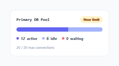
A connection pool's health isn't just "how full is it" — a pool sitting at 90% utilization with zero queued requests is fine; a pool with even one *waiting* request is actively causing latency for whoever is stuck behind it. This tile models that distinction directly: its health badge is computed from which specific condition is currently true, not from a single blended percentage.
Three distinct connection states, each visually and numerically tracked
The pool's connections are modeled as three separate counts — active (currently executing a query), idle (checked out but not currently in use, sitting ready), and waiting (a request that wants a connection but the pool is fully exhausted). The segmented bar renders one colored segment per state, sized proportionally to MAX_CONNECTIONS, so a glance at the bar's composition tells you not just how full the pool is, but *what kind* of full it is.
Health status logic checks waiting first, since it's the sharper signal
render()'s badge logic checks waiting > 0 before anything else — any waiting request at all immediately marks the pool "Saturated" (critical), because a nonzero wait queue means real requests are being actively delayed right now. Only if there's no queueing at all does the logic fall back to a softer check: whether total connections (active + idle) are at or above 85% of capacity, which is a "getting close" warning rather than an active problem. This ordering matters — checking utilization percentage first could mask a genuinely saturated-with-queued-requests pool that happens to still have a spare idle connection or two.
Simulated churn models realistic pool behavior, not just a random walk
tick() doesn't just nudge numbers up and down randomly — it models specific *events* a real pool experiences: a new query checking out a connection (active increases within capacity), a finished query returning its connection to idle, an unused idle connection being reaped, the pool filling up and a new request having to queue, and a queued request finally getting a freed connection. Each event has its own probability band and its own precondition (e.g. a connection can only be reaped if idle > 0), so the simulated numbers move in ways that resemble genuine pool dynamics rather than an unconstrained random walk that could, for instance, show waiting connections increasing while the pool has open capacity.
Clamping keeps every simulated value physically sensible
After every tick, active, idle, and waiting are all explicitly clamped — idle specifically clamped to MAX_CONNECTIONS - active, not just 0 to MAX_CONNECTIONS independently — so active + idle can never exceed the pool's real maximum capacity even if several probabilistic branches happened to push the numbers in the same direction in a short span.
Build with AI
Build, Understand, Optimize, and Extend It With AI
Ask an AI assistant to explain why checking for actively waiting connections before checking overall utilization percentage produces a more operationally useful health signal, and to discuss what other pool metrics (like average wait time or connection churn rate) might improve on this simple three-state model. It's also worth asking for a version that plots a short rolling history of the active/idle/waiting counts as a small sparkline strip beneath the current snapshot, or one that fires a visible alert animation the moment the pool first transitions into a saturated state.
Prompt to recreate it
Copy this into your AI assistant of choice to build the effect from scratch, or as a jumping-off point for your own variant:
Build a database connection pool monitoring dashboard tile in HTML, CSS and vanilla JavaScript with a realistic simulated live data feed — no external libraries.

Requirements:
- Track three distinct connection pool states as separate numeric counts: active (in use), idle (available), and waiting (requests queued because the pool is fully exhausted), all bounded by a defined maximum pool capacity.
- Render the current state as a segmented horizontal bar where each segment's width is proportional to its count relative to the maximum capacity, using a distinct color per state.
- Compute a health status badge from real conditions, not a single blended percentage: any nonzero waiting count must immediately produce a "critical/saturated" status regardless of overall utilization; only when there are zero waiting connections should a near-capacity utilization percentage (e.g. 85% or higher) produce a softer "warning" status; otherwise show a "healthy" status.
- Simulate realistic pool churn on an interval using a small set of distinct, named probabilistic events (e.g. a connection being checked out, a connection finishing and going idle, an idle connection being reaped, the pool filling and a request queueing, a queued request being served) rather than adjusting the three counts with unconstrained random noise.
- After every simulated update, ensure the active and idle counts together can never exceed the pool's maximum capacity, and that no count goes negative.
- Give the visualization an appropriate ARIA role and a dynamically updated descriptive label summarizing the exact current counts for screen reader users.
Want to tighten it up first? Run this prompt through the AI Prompt Studio to score it across 8 quality dimensions, catch anti-patterns, and tune the wording for Claude, ChatGPT, or Gemini before you paste it in.
Step by step
How to Use
- 1Watch the tile update liveActive, idle, and waiting counts change every ~1 second, simulating realistic connection pool churn.
- 2Watch the badge change under saturationWhen waiting connections appear, the badge immediately switches to "Saturated" — the clearest real signal of pool exhaustion.
- 3Adjust MAX_CONNECTIONSChange the pool's total capacity constant to model a differently-sized connection pool.
- 4Adjust the health thresholdsChange the 0.85 utilization threshold for the "Near limit" warning state to match your own alerting philosophy.
- 5Replace the simulation with real metricsSwap the tick() function's probabilistic state changes for periodic polling of your actual database driver's pool statistics endpoint.
Real-world uses
Common Use Cases
Got questions?
Frequently Asked Questions
A nonzero waiting count means real requests are actively queued and being delayed right now — the sharpest possible signal of genuine saturation. Utilization percentage alone can be misleading (a pool at 90% with zero waiters is fine), so waiting connections are checked first and immediately mark the pool critical regardless of the utilization number.
Yes — after every simulated tick, idle is explicitly clamped to MAX_CONNECTIONS - active (not just an independent 0-to-max clamp), which enforces that the two counts together can never exceed the pool's real total capacity, even if multiple state changes happened to push in the same direction within one tick.
tick() models specific named events — a connection checkout, a connection returning to idle, an idle connection being reaped, the pool filling and a request queueing, and a queued request being served — each with its own probability and precondition, rather than nudging the three numbers independently with no relationship between them.
Replace the tick() function's probabilistic state changes with periodic polling of your actual pool's real statistics — most database drivers and connection pool libraries (e.g. node-postgres's Pool, HikariCP) expose current active/idle/waiting counts directly, which you'd feed into the same render() function.
It's a visual indicator strip scaled from the waiting count (capped at a reasonable maximum width) rather than a literal fraction of pool capacity, since waiting requests aren't occupying pool slots the way active/idle connections are — its purpose is to make any nonzero waiting count immediately visible in the bar, not to represent an exact proportion.
Yes — change the 0.85 threshold (85% utilization) in the badge logic to whatever fraction matches your own operational alerting philosophy for when a pool nearing capacity deserves a warning versus staying "Healthy".