Learn Coding Visually
Learn to code with interactive, live-preview playgrounds — HTML, CSS, JavaScript, React & more.
 HTML Playground42 lessons · Click-based · Live preview
 CSS PlaygroundLearn CSS with a live editor
 JavaScript Playground60 lessons · DOM · Async · Canvas
 React PlaygroundLearn React with a live code editor
 GSAP PlaygroundLearn GSAP animation interactively
 SVG Playground44 lessons · shapes · paths · animation
 SCSS Playground45 lessons · Sass modules · tokens
 Tailwind PlaygroundLearn Tailwind CSS with a live editor
 Bootstrap 5 Playground50 lessons · live preview
CDN Cache Hit Ratio Widget — Free HTML CSS JS Snippet
CDN Cache Hit Ratio Widget · Dashboards · Plain HTML, CSS & JS · Live preview
What's included
Features
About this UI Snippet
CDN Cache Hit Ratio Widget — Animated SVG Ring, Live Counters & Per-Edge Breakdown
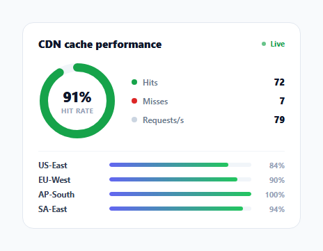
A CDN's entire value proposition comes down to one ratio: what fraction of requests get served from a nearby cache instead of round-tripping back to origin. This widget makes that ratio the visual centerpiece — a large animated ring shows the current overall hit rate, a running total of hits versus misses accumulates beside it, and a per-edge-location list breaks the same ratio down by region so a regression in one location doesn't hide inside a healthy global average.
The ring drawn with stroke-dasharray, not a chart library
The SVG has two overlapping circles of the same radius: a light gray track and a colored foreground circle whose stroke-dasharray is set to the circle's full circumference (CIRC = 2 * Math.PI * 48) and whose stroke-dashoffset is animated to represent the unfilled portion. Setting offset = CIRC - (pct / 100) * CIRC means at 0% the offset equals the full circumference (nothing visible) and at 100% the offset is 0 (the full circle drawn). The circle is rotated -90deg so the arc starts from 12 o'clock rather than the default 3 o'clock, matching how a progress ring is conventionally read. This is the standard pure-SVG technique for a progress ring with no canvas or charting dependency.
The ring's color itself carries meaning, not just its fill amount
setRing() sets the circle's stroke color based on threshold bands — green at 85%+, amber between 60-85%, red below 60% — recomputed on every tick. A cache hit ratio isn't just a number that goes up or down; it has industry-typical healthy ranges, and encoding that directly in the ring's color means a viewer doesn't need to know "is 72% good or bad" from memory, the amber color already answers that.
Per-request simulation, not a single random number per tick
simulateTick() doesn't just pick one random hit-rate percentage per second — it simulates a random *count* of individual requests (40 + Math.floor(Math.random() * 60)), routes each one to a randomly chosen edge location, and rolls a 90%-probability hit/miss outcome for each request individually before aggregating into both the global ring and each edge's own running total. This produces the same statistical texture real traffic has — some edges get more requests than others in a given tick purely by chance, and the overall ratio converges toward the underlying 90% probability over time rather than jumping around a single random value every second.
Per-edge bars reveal what the global ring average hides
The four .edge-row bars each compute their own hits / total percentage independently. Because every edge draws from the same 90% hit probability in this demo, they trend similarly, but in production this is exactly where regional cache configuration problems surface — an edge location with a stale cache-control policy or a recently added origin region can show a materially worse ratio than the global average while the ring alone stays reassuringly green.
Numbers formatted for scanability at scale
hitVal and missVal use .toLocaleString() rather than raw digit strings, so accumulated counts read as "12,480" instead of "12480" once the running totals grow past a few thousand over a long-running dashboard session.
Build with AI
Build, Understand, Optimize, and Extend It With AI
Paste this snippet's HTML, CSS, and JS into an AI coding assistant like Claude and ask it to explain exactly how the stroke-dasharray and stroke-dashoffset values combine to draw a partial circle, and why the SVG circle needs a -90 degree rotation for the ring to start filling from the top rather than the right side. The same assistant can help optimize it — for instance asking whether the per-request simulation loop would still perform well if the requests-per-second figure were scaled up by 100x for a much higher-traffic demo. It's also useful for extending the widget: ask it to add a historical sparkline of hit rate over the last few minutes, support configurable color thresholds passed as props, or add a tooltip on each edge bar showing raw hit and miss counts on hover. Treat the code less like a finished artifact and more like a starting point for a conversation.
Prompt to recreate it
Copy this into your AI assistant of choice to build the effect from scratch, or as a jumping-off point for your own variant:
Build a "CDN cache hit ratio" dashboard widget in HTML, CSS, and vanilla JavaScript — no charting or SVG library, hand-rolled SVG only.

Requirements:
- Draw an animated circular progress ring using two overlapping SVG circles (a static background track and a colored foreground arc) with the foreground arc's fill percentage controlled purely through stroke-dasharray and stroke-dashoffset math — no canvas, no external charting library — and display the current overall cache hit percentage as text in the ring's center.
- The ring's stroke color must switch between at least three distinct color bands (for example green, amber, red) based on which percentage range the current hit rate falls into, recalculated every time the value updates.
- Simulate live traffic on an interval (roughly every one to two seconds): generate a random number of individual simulated requests per tick, route each one to a randomly chosen edge location from a list of at least four named regions, and independently roll a hit-or-miss outcome for each individual request (do not just generate one random percentage per tick) — aggregate these into a running global hit/miss total and per-edge-location hit/miss totals.
- Display running total hit and miss counters (formatted with thousands separators) and a requests-per-second figure that update on each tick, plus a live-updating requests-per-second value.
- Render one horizontal bar per edge location showing that location's own independently computed hit-rate percentage, so a regional regression is visible even when the global ring stays in a healthy color band.
- All numeric transitions (ring fill, bar widths) should animate smoothly between values rather than jumping instantly.
Want to tighten it up first? Run this prompt through the AI Prompt Studio to score it across 8 quality dimensions, catch anti-patterns, and tune the wording for Claude, ChatGPT, or Gemini before you paste it in.
Step by step
How to Use
- 1Watch the ring and counters updateEvery 1.5 seconds a new batch of simulated requests updates the hit-rate ring, the running hit/miss totals, and the requests-per-second figure.
- 2Watch the ring change colorThe ring turns green at 85%+ hit rate, amber between 60-85%, and red below 60%, recalculated on every update.
- 3Watch per-edge barsEach of the four edge locations tracks its own independent hit ratio, useful for spotting a regional regression the global ring average might hide.
- 4Replace the simulation with real metricsSwap simulateTick() for a fetch call to your CDN provider's analytics API (Cloudflare, Fastly, CloudFront) polling real hit/miss counts per edge location.
- 5Adjust the color thresholdsChange the 85 and 60 percentage breakpoints in setRing() to match what counts as healthy for your specific CDN configuration and content mix.
- 6Export in your formatClick "HTML" for a standalone file, "JSX" for a React component, or "Tailwind" for a Tailwind CSS version.
Real-world uses
Common Use Cases
Got questions?
Frequently Asked Questions
Two SVG circles of the same radius overlap — a static gray track and a colored foreground circle. The foreground circle's stroke-dasharray is set to its full circumference, and its stroke-dashoffset is set to circumference minus (percentage/100 times circumference), which visually reveals more of the stroke as the percentage rises. Rotating the circle -90 degrees makes the arc start from the top instead of the default right-hand starting point.
setRing() sets the stroke color to green at 85% or higher, amber between 60% and 85%, and red below 60%, recalculated on every update. This lets the color itself communicate whether the current hit rate is healthy without requiring the viewer to know what a "good" cache hit ratio number looks like.
simulateTick() picks a random request count per tick and rolls an individual hit/miss outcome (with a 90% hit probability) for each simulated request, aggregating them into per-edge and global totals. This produces the same statistical variability real traffic shows — some ticks and some edges naturally skew higher or lower by chance — rather than a single smoothly random percentage that would not resemble real request-level data.
Each edge tracks its own hits and total requests independently and computes its own percentage. In production this is exactly where a regional cache misconfiguration, a stale cache-control policy, or a newly added origin region would surface as a below-average bar even while the global ring stays in a healthy color band, since the ring only reflects the aggregate across all edges combined.
Replace simulateTick() with a periodic fetch() call to your CDN's analytics or logs API (for example Cloudflare Analytics, Fastly real-time stats, or CloudFront metrics), map the response into totalHits, totalMisses, and each EDGES entry's hits/total counts, and call the same setRing() and renderEdges() functions to update the display from real numbers instead of the random simulation.
toLocaleString() formats large numbers with thousands separators (for example "12,480" instead of "12480"), which keeps the running totals easy to scan at a glance once a long-running dashboard session accumulates counts into the thousands or more.