.element {
  /* no filters applied */
}
Related Tools
 CSS Transform GeneratorTranslate, rotate, scale
 CSS Clip-path GeneratorVisual polygon editor
 Glassmorphism GeneratorFrosted glass effect builder
 Box Shadow GeneratorCSS shadow studio
 Gradient GeneratorCSS gradient builder
 Mesh Gradient GeneratorSVG mesh gradient builder
 Color PickerHEX · RGB · HSL · OKLCH
 CSS Animation GeneratorKeyframe animation builder
CSS Filter Generator — Visual Image Filter Builder Online
What's included
Features
About this tool
Style Any Image With CSS Filters — Blur, Brightness, Sepia, Hue-Rotate — Live Side-by-Side Preview
You want to apply a vintage tone to a hero image, desaturate a photo on hover to signal interactivity, or add a CSS drop-shadow that follows the transparent edges of a PNG icon instead of boxing its rectangle. The CSS filter property handles all of this — but figuring out the right combination of values without a live preview is guesswork. Adjust the sliders here and see the original and filtered images side by side.
Nine filter functions with individual sliders: blur() for gaussian blur, brightness() and contrast() for tonal control, grayscale() and sepia() for color mode, hue-rotate() for color wheel shifts, invert() for negative effects, opacity() and saturate() for intensity. The drop-shadow panel is separate: it uses the element's alpha channel to cast a shape-aware shadow that follows transparent PNG cutouts — unlike box-shadow which only casts a rectangular shadow.
Filter functions apply in sequence, left to right, each one operating on the pixel output of the function before it — so grayscale(100%) sepia(30%) and sepia(30%) grayscale(100%) are not equivalent, since desaturating first then adding sepia tint produces a different tone than tinting first and then stripping all color. The generator writes functions in a fixed, tested order and drops any function left at its identity value (brightness at 100%, blur at 0px, and so on) so the output stays short and readable instead of listing nine functions every time. Because filter triggers GPU compositing rather than a full repaint, static filtered elements are cheap, but animating blur() specifically forces the GPU to re-rasterize every frame — worth knowing before wiring a filter transition to a hover state on a large element, where a lower blur ceiling or a will-change: filter hint keeps things smooth. It's also worth distinguishing filter from backdrop-filter: filter restyles the element and everything painted inside it, while backdrop-filter restyles only what's visible behind a semi-transparent element — the mechanism behind frosted-glass overlays, which this tool does not attempt to preview since it needs real content behind the element to blur.
Ten preset filter combinations — Vintage, Grayscale, Cold, Warm, High Contrast, Dreamy, Neon, Matte, Night Vision — load as starting points you can refine. Preview on four built-in sample images or upload your own. The generated CSS includes both filter and -webkit-filter for full Safari compatibility, and omits any filter functions set to their identity values to keep the output clean.
Step by step
How to Use
- 1Start with a preset or from scratchClick any of the 10 preset buttons at the top of the left panel to instantly load a pre-designed filter combination. Vintage, Grayscale, Cold, Warm, High Contrast, Dreamy, Neon, Matte, and Night Vision are good starting points. Click None to clear all filters and start from zero.
- 2Adjust the filter slidersUse the nine filter sliders to fine-tune each CSS function: Blur (0–20px), Brightness (0–300%), Contrast (0–300%), Saturate (0–300%), Grayscale (0–100%), Sepia (0–100%), Hue-Rotate (0–360°), Invert (0–100%), Opacity (0–100%). Type a value directly into the number input for precision. The preview updates in real time.
- 3Add a drop-shadowIn the Drop Shadow section below the filter sliders, toggle the switch to enable it. Set X and Y offset in pixels, the blur radius, the shadow color via color picker, and shadow opacity. The drop-shadow() function traces the element's alpha channel — unlike box-shadow it follows the actual shape of transparent PNGs and SVGs.
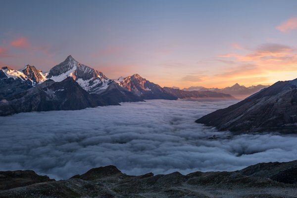
- 4Choose a preview imageClick any of the four sample image tabs — Landscape, Portrait, City, Color — to switch the preview image. Click Upload to use your own image file from disk. Paste an image URL into the URL input and click Apply to test with a remote image.
- 5Compare original vs. filteredThe right panel always shows the original and filtered images side by side. Every slider change updates the Filtered panel instantly — no need to toggle anything to see the before-and-after comparison.
- 6Copy the generated CSSClick Copy CSS in the header or output panel to copy the complete filter declaration. The output includes both filter and -webkit-filter for full Safari compatibility, and omits any filter functions that are set to their identity defaults to keep the CSS clean.
Real-world uses
Common Use Cases
Got questions?
Frequently Asked Questions
Use the CSS filter property with the appropriate function. For blur: filter: blur(4px); For brightness: filter: brightness(120%); For both combined: filter: blur(4px) brightness(120%); Multiple filter functions are separated by spaces and applied left-to-right. This tool generates the combined filter declaration as you adjust the sliders — copy the output and paste it into your CSS.
Yes. List multiple functions in a single filter declaration separated by spaces: filter: brightness(120%) contrast(110%) saturate(130%) hue-rotate(10deg). Each function is applied to the output of the previous one in left-to-right order, so sequence matters. This tool combines all your slider values into one clean declaration and omits functions set to their identity values to keep the output minimal.
drop-shadow() is a CSS filter function that traces the element's actual alpha channel — it follows transparent cutouts in PNG images and SVG icons, producing a shadow that matches the visual shape. box-shadow casts a shadow from the rectangular bounding box regardless of transparency, so a circular PNG would get a rectangular shadow. For transparent PNGs and SVG icons, always use filter: drop-shadow() instead of box-shadow.
CSS filters trigger GPU compositing — efficient for static elements, but animating filter values (especially blur()) can be expensive because each frame requires GPU re-rasterization. Keep blur radius below 10px for animated elements, avoid filtering large full-page sections, and add will-change: filter before animating to let the browser promote the element to its own compositing layer ahead of time.
Apply hue-rotate() to shift the icon's colors around the HSL color wheel. hue-rotate(120deg) shifts a blue icon to green. hue-rotate(240deg) shifts it to red. Combine with saturate() to boost or reduce color intensity. This lets you recolor any monochrome or single-hue icon through CSS without editing the SVG source — useful for icon libraries across multiple color themes.
Yes. CSS filter works on any HTML element — divs, text, buttons, SVG, video, canvas, and page sections. Applying filter to a container affects that element and all its children as a flattened composite. This is how you blur a background section behind a modal, desaturate an entire card on hover, or apply a warm tone to a full page region without editing each child element.
CSS filter is supported in all modern browsers — Chrome, Firefox, Safari, Edge — without vendor prefixes. Older Safari (pre-9.1) required -webkit-filter. This tool's output includes both filter and -webkit-filter for maximum compatibility. IE does not support CSS filter, but IE usage is negligible for modern projects.
Ten presets: Vintage (warm sepia with slight desaturation), Grayscale (full desaturation), Cold (blue-shifted hue with boosted contrast), Warm (orange-shifted hue with raised brightness), High Contrast (maximized contrast), Dreamy (soft blur with brightened tones), Neon (high saturation with hue shift), Matte (reduced contrast, faded look), Night Vision (green-shifted with boosted brightness), and None (all defaults). Each can be refined further with the individual sliders.
Apply a full grayscale filter in the base state and remove it on hover, or do the reverse — start with color and fade to grayscale on hover. For a hover desaturation effect: .card img { filter: none; transition: filter 0.3s ease; } .card img:hover { filter: grayscale(100%); }. This signals interactivity by "dimming" an image when the user hovers, a common pattern for clickable image grids and portfolio galleries. You can soften the effect by using grayscale(60%) for a partial desaturation instead of full conversion to black and white.
Use backdrop-filter instead of filter. backdrop-filter: blur(10px) applies the blur to whatever is rendered behind the element (the backdrop), not to the element itself — this is the CSS property that creates the frosted glass effect seen in macOS, iOS, and modern SaaS UIs. The element needs a semi-transparent background to let the blurred backdrop show through: background: rgba(255,255,255,0.3). backdrop-filter is supported in all modern browsers. Note: filter: blur() applied to a container blurs the container AND all its children, which is rarely what you want for overlay panels — backdrop-filter is the right tool for that use case.
Set filter: grayscale(100%) on the image element. A value of 100% produces a fully black-and-white image; values between 0% and 100% produce partial desaturation. To restore color on hover: img { filter: grayscale(100%); transition: filter 0.4s ease; } img:hover { filter: grayscale(0%); }. You can also combine grayscale with contrast for a high-contrast monochrome look: filter: grayscale(100%) contrast(120%). This approach changes only the visual rendering — the original image file is unmodified, and the full-color image is restored instantly if the filter is removed.