Learn Coding Visually
Learn to code with interactive, live-preview playgrounds — HTML, CSS, JavaScript, React & more.
 HTML Playground42 lessons · Click-based · Live preview
 CSS PlaygroundLearn CSS with a live editor
 JavaScript Playground60 lessons · DOM · Async · Canvas
 React PlaygroundLearn React with a live code editor
 GSAP PlaygroundLearn GSAP animation interactively
 SVG Playground44 lessons · shapes · paths · animation
 SCSS Playground45 lessons · Sass modules · tokens
 Tailwind PlaygroundLearn Tailwind CSS with a live editor
 Bootstrap 5 Playground50 lessons · live preview
Expandable Row Detail Table — Accordion Rows for Order/Record Line Items
Expandable Row Detail Table · Tables · Plain HTML, CSS & JS · Live preview
What's included
Features
About this UI Snippet
Expandable Row Detail Table — Inline Drill-Down Without a Modal
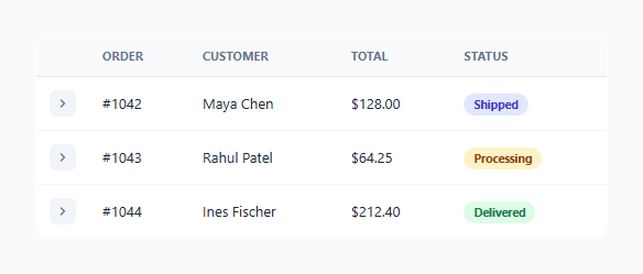
Showing every order's full line-item breakdown directly in a table would make it unreadable; hiding that detail behind a separate page or modal adds friction for a quick check. This pattern splits the difference: each row's detail is a second, adjacent table row that stays hidden until the user expands it, keeping the list scannable by default while making full detail one click away, in place, with no navigation.
Two rows per record, connected by a data attribute, not DOM adjacency alone
Each record is actually two <tr> elements — a .row-main summary row and a .row-detail row directly beneath it containing a single full-width <td colspan="5"> with the detail content inside. They're linked by matching data-row/data-detail-for values rather than assumed adjacency, so the toggle logic — table.querySelector(.row-detail[data-detail-for="${rowId}"]) — finds the correct detail row explicitly even if the table's structure changes, rather than relying on fragile "next sibling" DOM traversal that would break if anything were inserted between them.
aria-expanded on the row itself, not just a visual class
.row-main carries aria-expanded="true"/"false" directly, toggled in the same click handler that shows/hides the detail row — giving assistive technology accurate, real-time information about which rows are currently expanded, matching how a native disclosure widget should behave, rather than relying purely on a CSS class a screen reader has no way to interpret.
hidden attribute, not just CSS display, for the detail row
The collapsed detail row uses the native hidden boolean attribute rather than a CSS class toggling display: none — functionally similar for visual rendering, but hidden is the semantically correct HTML mechanism for "this content is not currently relevant," and it means the detail row is guaranteed to be excluded from things like browser find-in-page and the accessibility tree without any additional CSS needing to account for it.
Whole-row click as a convenience, not a replacement for the toggle button
Beyond the dedicated toggle button, clicking anywhere else on a .row-main row also triggers the same expand/collapse by simply calling .click() on that row's own toggle button — reusing the exact same code path rather than duplicating the expand logic, so there is only one real implementation of "toggle this row" that both interaction methods funnel through.
Build with AI
Build, Understand, Optimize, and Extend It With AI
Ask an AI assistant to explain why linking summary and detail rows via explicit data attributes is more robust than relying on the detail row always being the "next sibling" in the DOM, and what could break if that assumption were made instead. It's also worth asking for a version that only allows one row to be expanded at a time (accordion-exclusive behavior), or one that lazy-loads a row's detail content via a fetch call the first time it's expanded rather than rendering it all upfront.
Prompt to recreate it
Copy this into your AI assistant of choice to build the effect from scratch, or as a jumping-off point for your own variant:
Build an expandable-row data table in HTML, CSS and vanilla JavaScript where clicking a row reveals a full-width detail panel beneath it — no external libraries.

Requirements:
- A table where each data record is represented by two adjacent table rows: a compact summary row and a hidden detail row containing a single full-width cell with expanded content (e.g. line items and metadata).
- Link each summary row to its corresponding detail row using explicit matching data attributes (not by assuming DOM adjacency), so the toggle logic looks up the correct detail row by that identifier.
- Use the native hidden attribute (not a CSS display:none class) to control the detail row's collapsed state.
- Implement the expand/collapse toggle using a single delegated click listener on the table itself, so rows added to the table later work without needing additional listener setup.
- Keep the summary row's aria-expanded attribute and the toggle button's aria-label text in sync with the actual expanded/collapsed state at all times.
- Make the entire summary row clickable to expand/collapse it (not just a small toggle icon), while still keeping only one real implementation of the toggle logic that both interaction paths share.
Want to tighten it up first? Run this prompt through the AI Prompt Studio to score it across 8 quality dimensions, catch anti-patterns, and tune the wording for Claude, ChatGPT, or Gemini before you paste it in.
Step by step
How to Use
- 1Pair every summary row with a matching detail rowGive both rows the same identifier via data-row on the .row-main and data-detail-for on its .row-detail.
- 2Keep the detail row hidden by defaultAdd the hidden attribute (not a CSS class) to every .row-detail on initial render.
- 3Set colspan to match your column countThe detail row's single <td> needs colspan equal to the number of columns in your table header for the panel to span full width.
- 4Customize the detail panel content freelyAnything can go inside .detail-panel — line items, metadata, even a small nested table or action buttons.
- 5Add or remove rows dynamicallySince the click handler is delegated on the table itself, any new .row-main/.row-detail pair added later works immediately with no extra listener wiring.
Real-world uses
Common Use Cases
Got questions?
Frequently Asked Questions
Each summary row has a data-row identifier and its matching detail row has a data-detail-for attribute with the same value; the click handler looks up the detail row explicitly via that attribute match rather than assuming it's always the very next sibling in the DOM.
hidden is the semantically correct native HTML mechanism for content that isn't currently relevant — it's automatically excluded from the accessibility tree and browser find-in-page without requiring any CSS rule, unlike a custom class that only has meaning because a stylesheet happens to define display:none for it.
Both — clicking anywhere on a .row-main row (except directly on the toggle button, which has its own handler) programmatically clicks that row's toggle button, so the whole row is a convenient click target while the actual expand/collapse logic exists in exactly one place.
No — the click listener is delegated on the table element itself using event bubbling and .closest(), so any new .row-main/.row-toggle pairs added to the table later work immediately without additional JavaScript wiring.
It must be set manually to match the number of columns in your table header — in this demo that's 5 (toggle, order, customer, total, status) — so the detail panel visually spans the table's full width rather than only one column.
Yes — the summary row carries a live aria-expanded attribute reflecting its actual current state, and the toggle button's aria-label text switches between "Expand" and "Collapse" wording, both updated in the same handler that shows or hides the detail row.