


Learn Coding Visually
Learn to code with interactive, live-preview playgrounds — HTML, CSS, JavaScript, React & more.
 HTML Playground42 lessons · Click-based · Live preview
 CSS PlaygroundLearn CSS with a live editor
 JavaScript Playground60 lessons · DOM · Async · Canvas
 React PlaygroundLearn React with a live code editor
 GSAP PlaygroundLearn GSAP animation interactively
 SVG Playground44 lessons · shapes · paths · animation
 SCSS Playground45 lessons · Sass modules · tokens
 Tailwind PlaygroundLearn Tailwind CSS with a live editor
 Bootstrap 5 Playground50 lessons · live preview
Shipping Address Form — Live Validation with Jump-to-Field Error Summary
Shipping Address Form — Live Validation Error Summary · Forms · Plain HTML, CSS & JS · Live preview
What's included
Features
About this UI Snippet
Shipping Address Form with a Live Error Summary Panel
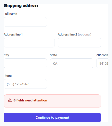
Most inline-validated forms only show an error message directly beneath the offending field. That works fine when a single field is wrong, but on a multi-field address form with several problems at once, a user has to scroll and hunt through the form to find every red-bordered input. This snippet adds a second layer: a persistent error summary panel that lists every current validation problem in one place, with each item acting as a jump link back to its field.
Two validation moments, one shared function
validateField(input) is the single source of truth for whether a field is valid — it checks required, pattern, and minLength against the input's current value and returns a human-readable message string (or an empty string when valid). Both the per-field blur listener and the whole-form submit handler call this exact same function, so the inline error text under a field and its corresponding line in the summary panel can never disagree about what's wrong.
Why the summary panel is a live region
The panel has role="alert" aria-live="polite", so when it changes content — appearing after a failed submit, or shrinking as fields get fixed — a screen reader announces the update automatically without requiring focus to move there manually. The heading text is generated dynamically (<strong id="errCount"> plus a pluralized "field/fields" suffix) so it reads naturally whether there's one problem or five.
Turning error messages into jump links
Each <li> in the summary contains a <button data-target="fieldName">, not a plain span. Clicking one calls .focus() and .scrollIntoView({ behavior: 'smooth', block: 'center' }) on the matching input — so the summary functions as a table of contents for what's broken, letting a user with many errors fix them one by one from a single stationary list instead of scrolling the whole form repeatedly.
Debounced re-validation while typing
Once a field has been marked invalid, the input event re-validates it on every keystroke so the red border and summary entry clear the instant the user corrects the mistake — but fields that haven't been touched yet, or are already valid, are left alone until blur, avoiding the jarring experience of seeing "required" errors appear while a user is still mid-way through typing their first character.
Build with AI
Build, Understand, Optimize, and Extend It With AI
Ask an AI assistant to explain why sharing one validateField function between the blur handler and the submit handler prevents the inline error and the summary panel from ever drifting out of sync, and to suggest how the same pattern could be extended to async validation (e.g. a ZIP-to-city/state lookup). It's also worth asking for a version that supports per-country field sets, swapping the required/pattern rules based on a country selector.
Prompt to recreate it
Copy this into your AI assistant of choice to build the effect from scratch, or as a jumping-off point for your own variant:
Build a shipping address form in HTML, CSS and vanilla JavaScript with live per-field validation and a persistent error summary panel — no external form libraries.

Requirements:
- Fields for full name, address line 1, address line 2 (optional), city, state, ZIP code, and phone, using native HTML5 required, pattern and minlength attributes for validation rules.
- A single JavaScript validation function used both on field blur and on form submit, so inline error text and the summary panel can never disagree about a field's validity.
- A persistent, initially-hidden error summary panel above the submit button with role="alert" and aria-live="polite", listing every current validation problem with a human-readable message.
- Each item in the summary panel must be a clickable element that moves keyboard focus to its corresponding field and smooth-scrolls it into view.
- Once a field has been marked invalid, it should re-validate on every keystroke so its error clears immediately when corrected, without validating untouched fields prematurely.
- On successful submit with no errors, hide the summary panel and show a success status message; on failed submit, populate and reveal the summary panel.
Want to tighten it up first? Run this prompt through the AI Prompt Studio to score it across 8 quality dimensions, catch anti-patterns, and tune the wording for Claude, ChatGPT, or Gemini before you paste it in.
Source Code
<div class="demo">
  <form class="ship-form" id="shipForm" novalidate>
    <h2>Shipping address</h2>

    <div class="row">
      <label class="field">
        <span>Full name</span>
        <input type="text" name="fullName" data-label="Full name" required minlength="2" />
        <small class="err" data-for="fullName"></small>
      </label>
    </div>

    <div class="row two">
      <label class="field">
        <span>Address line 1</span>
        <input type="text" name="address1" data-label="Address line 1" required minlength="4" />
        <small class="err" data-for="address1"></small>
      </label>
      <label class="field">
        <span>Address line 2 <em>(optional)</em></span>
        <input type="text" name="address2" data-label="Address line 2" />
      </label>
    </div>

    <div class="row three">
      <label class="field">
        <span>City</span>
        <input type="text" name="city" data-label="City" required />
        <small class="err" data-for="city"></small>
      </label>
      <label class="field">
        <span>State</span>
        <input type="text" name="state" data-label="State" required maxlength="2" placeholder="CA" />
        <small class="err" data-for="state"></small>
      </label>
      <label class="field">
        <span>ZIP code</span>
        <input type="text" name="zip" data-label="ZIP code" required pattern="^\d{5}(-\d{4})?$" placeholder="94103" />
        <small class="err" data-for="zip"></small>
      </label>
    </div>

    <div class="row">
      <label class="field">
        <span>Phone</span>
        <input type="tel" name="phone" data-label="Phone" required pattern="^[\d\s()+-]{7,}$" placeholder="(555) 123-4567" />
        <small class="err" data-for="phone"></small>
      </label>
    </div>

    <div class="summary" id="summary" role="alert" aria-live="polite" hidden>
      <div class="summary-head">
        <svg width="16" height="16" viewBox="0 0 24 24" fill="none" stroke="currentColor" stroke-width="2.4" stroke-linecap="round" stroke-linejoin="round"><path d="M10.3 3.9 1.8 18a2 2 0 0 0 1.7 3h17a2 2 0 0 0 1.7-3L13.7 3.9a2 2 0 0 0-3.4 0Z"/><path d="M12 9v4M12 17h.01"/></svg>
        <span><strong id="errCount">0</strong> field<span id="errPlural">s</span> need attention</span>
      </div>
      <ul id="summaryList"></ul>
    </div>

    <button type="submit" class="submit-btn">Continue to payment</button>
    <p class="status" id="status" role="status" aria-live="polite"></p>
  </form>
</div>
* { box-sizing: border-box; margin: 0; padding: 0; }
body { font-family: system-ui, sans-serif; background: #f8fafc; display: flex; align-items: center; justify-content: center; min-height: 100vh; padding: 24px; }
.ship-form { width: 460px; max-width: 100%; background: #fff; border: 1px solid #e2e8f0; border-radius: 16px; padding: 28px; display: flex; flex-direction: column; gap: 16px; }
h2 { font-size: 17px; font-weight: 800; color: #111827; }
.row { display: flex; gap: 12px; }
.row.two label:first-child { flex: 1.4; }
.row.two label:last-child { flex: 1; }
.row.three label { flex: 1; }
.field { display: flex; flex-direction: column; gap: 6px; }
.field span { font-size: 12.5px; font-weight: 600; color: #374151; }
.field span em { font-style: normal; color: #9ca3af; font-weight: 500; }
.field input { padding: 10px 12px; border: 1.5px solid #e2e8f0; border-radius: 9px; font-size: 13.5px; font-family: inherit; color: #111827; transition: border-color 0.15s, box-shadow 0.15s; }
.field input:focus-visible { outline: none; border-color: #6366f1; box-shadow: 0 0 0 3px rgba(99,102,241,0.15); }
.field input.invalid { border-color: #ef4444; }
.field input.invalid:focus-visible { box-shadow: 0 0 0 3px rgba(239,68,68,0.15); }
.field input.valid { border-color: #86efac; }
.err { font-size: 11.5px; color: #dc2626; font-weight: 600; min-height: 1px; }
.summary { background: #fef2f2; border: 1px solid #fecaca; border-radius: 12px; padding: 14px 16px; display: flex; flex-direction: column; gap: 8px; }
.summary-head { display: flex; align-items: center; gap: 8px; font-size: 13px; font-weight: 700; color: #991b1b; }
.summary ul { list-style: none; display: flex; flex-direction: column; gap: 4px; padding-left: 24px; }
.summary li { font-size: 12.5px; }
.summary li a { color: #b91c1c; font-weight: 600; text-decoration: underline; text-underline-offset: 2px; cursor: pointer; background: none; border: none; padding: 0; font: inherit; }
.submit-btn { margin-top: 4px; background: #4f46e5; color: #fff; border: none; padding: 12px; border-radius: 10px; font-size: 14px; font-weight: 700; cursor: pointer; transition: background 0.15s; }
.submit-btn:hover { background: #4338ca; }
.status { font-size: 12.5px; color: #059669; font-weight: 600; min-height: 1px; }const form = document.getElementById('shipForm');
const summary = document.getElementById('summary');
const summaryList = document.getElementById('summaryList');
const errCount = document.getElementById('errCount');
const errPlural = document.getElementById('errPlural');
const statusEl = document.getElementById('status');
function validateField(input) {
const msgEl = form.querySelector(`.err[data-for="${input.name}"]`);
let message = '';
if (input.required && !input.value.trim()) {
message = `${input.dataset.label} is required`;
} else if (input.value && input.pattern && !new RegExp(input.pattern).test(input.value.trim())) {
message = `Enter a valid ${input.dataset.label.toLowerCase()}`;
} else if (input.value && input.minLength > 0 && input.value.trim().length < input.minLength) {
message = `${input.dataset.label} is too short`;
}
input.classList.toggle('invalid', !!message);
input.classList.toggle('valid', !message && !!input.value);
if (msgEl) msgEl.textContent = message;
return message;
}
function validateAll() {
const errors = [];
form.querySelectorAll('input[data-label]').forEach((input) => {
const message = validateField(input);
if (message) errors.push({ input, message });
});
return errors;
}
function renderSummary(errors) {
if (errors.length === 0) {
summary.hidden = true;
summaryList.innerHTML = '';
return;
}
summary.hidden = false;
errCount.textContent = errors.length;
errPlural.textContent = errors.length === 1 ? '' : 's';
summaryList.innerHTML = errors
.map(({ input, message }) => `<li><button type="button" data-target="${input.name}">${message}</button></li>`)
.join('');
}
form.querySelectorAll('input[data-label]').forEach((input) => {
input.addEventListener('blur', () => validateField(input));
input.addEventListener('input', () => {
if (input.classList.contains('invalid')) validateField(input);
});
});
summaryList.addEventListener('click', (e) => {
const btn = e.target.closest('button[data-target]');
if (!btn) return;
const target = form.querySelector(`[name="${btn.dataset.target}"]`);
target.focus();
target.scrollIntoView({ behavior: 'smooth', block: 'center' });
});
form.addEventListener('submit', (e) => {
e.preventDefault();
const errors = validateAll();
renderSummary(errors);
if (errors.length === 0) {
statusEl.textContent = 'Address verified — continuing to payment…';
} else {
statusEl.textContent = '';
summary.querySelector('.summary-head').focus?.();
}
});Step by step
How to Use
- 1Add data-label to every validated inputThe data-label attribute supplies the human-readable field name used in both the inline error and the summary panel.
- 2Set required, pattern and minlength as neededvalidateField reads these native HTML5 validation attributes directly — no separate validation config object to maintain.
- 3Add a matching <small class="err" data-for="fieldName">Each validated field needs a sibling error element whose data-for matches the input's name attribute.
- 4Customize the regex patternsUpdate the pattern attributes on zip and phone in the HTML panel to match your target country's formats.
- 5Wire up the success pathReplace the statusEl.textContent assignment in the submit handler with your actual form submission or navigation logic.
Real-world uses
Common Use Cases
Got questions?
Frequently Asked Questions
Inline errors help while filling out a single field; the summary panel helps once several fields have gone wrong and the user needs a consolidated list to work through — the two serve different moments in the same flow, so this form includes both.
No — it is an aria-live region that gets announced without stealing focus. Focus only moves when the user explicitly clicks a summary entry, which is the more predictable and less disorienting pattern.
Add the input with a unique name, a data-label, and the relevant required/pattern/minlength attributes, plus a matching <small class="err" data-for="name"> element — validateAll() picks it up automatically since it queries all input[data-label] elements.
Yes — after an API response with field errors, call the same renderSummary() function with an array of {input, message} pairs built from the server response, reusing the identical summary UI for both client and server errors.
novalidate disables the browser's default validation bubbles so this custom validateField/renderSummary logic is the only validation UI shown, keeping styling and messaging fully consistent across browsers.
The default patterns assume a US-style ZIP and phone format. For international shipping, relax or replace the zip and phone pattern attributes, and consider adding a country selector that swaps which fields are required.