Source Code
<div class="page">

  <!-- Article excerpt -->
  <div class="card">
    <div class="card-tag">Article</div>
    <h3 class="card-title">The future of declarative UI frameworks</h3>
    <div class="read-more-wrap" id="rm1">
      <div class="rm-content clamped" id="rm1-content">
        <p>Modern frontend development has been transformed by declarative UI frameworks. React, Vue, and Svelte have fundamentally changed how we think about building interfaces — moving from imperative DOM manipulation to describing what the UI should look like given a particular state.</p>
        <p>The next wave of innovation focuses on eliminating the mental overhead of synchronising UI state with application state. Server components, signals, and fine-grained reactivity all tackle this problem from different angles.</p>
        <p>What unites them is a shared goal: making the mapping between data and UI as frictionless as possible. The frameworks of 2030 will likely feel radically different from what we use today, yet the underlying principles — declarative composition, unidirectional data flow — will remain.</p>
      </div>
      <button class="rm-btn" id="rm1-btn" onclick="toggle('rm1')">Read more</button>
    </div>
  </div>

  <!-- Product description -->
  <div class="card">
    <div class="card-tag">Product</div>
    <h3 class="card-title">Professional Mechanical Keyboard</h3>
    <div class="read-more-wrap" id="rm2">
      <div class="rm-content clamped" id="rm2-content">
        <p>Built for professionals who spend long hours at the keyboard. The Cherry MX Brown switches provide tactile feedback without the loud click of blue switches — perfect for open-plan offices or home setups where noise is a concern.</p>
        <p>The aluminium top plate keeps the keyboard rigid under heavy typing loads. PBT double-shot keycaps resist shine after years of use. The programmable RGB lighting per-key gives you full customisation from our companion app.</p>
        <p>Full N-key rollover ensures every keystroke registers, even during intense typing bursts. The detachable USB-C cable means no more bent connectors after years of use.</p>
      </div>
      <button class="rm-btn" id="rm2-btn" onclick="toggle('rm2')">Read more</button>
    </div>
  </div>

</div>
* { box-sizing: border-box; margin: 0; padding: 0; }
body { font-family: system-ui, sans-serif; background: #f8fafc; min-height: 100vh; display: flex; align-items: center; justify-content: center; padding: 32px 24px; }
.page { width: 100%; max-width: 500px; display: flex; flex-direction: column; gap: 16px; }
.card { background: #fff; border: 1px solid #e2e8f0; border-radius: 14px; padding: 20px; }
.card-tag { font-size: 10px; font-weight: 700; letter-spacing: 1px; text-transform: uppercase; color: #6366f1; margin-bottom: 6px; }
.card-title { font-size: 15px; font-weight: 700; color: #0f172a; margin-bottom: 12px; }
.read-more-wrap { position: relative; }
/* Clamped state — shows 3 lines with gradient fade */
.rm-content { font-size: 14px; color: #475569; line-height: 1.75; transition: max-height 0.4s ease; overflow: hidden; }
.rm-content.clamped { max-height: 4.5em; /* ~3 lines at 1.5em line-height */ position: relative; }
.rm-content.clamped::after { content: ''; position: absolute; bottom: 0; left: 0; right: 0; height: 2em; background: linear-gradient(to bottom, transparent, #fff); pointer-events: none; }
.rm-content p { margin-bottom: 10px; }
.rm-content p:last-child { margin-bottom: 0; }
/* Expanded state */
.rm-content.expanded { max-height: 600px; }
.rm-content.expanded::after { display: none; }
/* Button */
.rm-btn { display: inline-flex; align-items: center; gap: 4px; margin-top: 8px; background: transparent; border: none; font-size: 13px; font-weight: 700; color: #6366f1; cursor: pointer; padding: 0; font-family: inherit; transition: color 0.12s; }
.rm-btn:hover { color: #4f46e5; }
.rm-btn::after { content: '↓'; font-size: 12px; transition: transform 0.3s; }
.rm-btn.expanded::after { transform: rotate(180deg); }function toggle(id) {
const content = document.getElementById(id + '-content');
const btn = document.getElementById(id + '-btn');
const isExpanded = content.classList.toggle('expanded');
content.classList.toggle('clamped', !isExpanded);
btn.classList.toggle('expanded', isExpanded);
btn.textContent = isExpanded ? 'Read less' : 'Read more';
btn.appendChild(Object.assign(document.createElement('span'), {}));
}Learn Coding Visually
Learn to code with interactive, live-preview playgrounds — HTML, CSS, JavaScript, React & more.
 HTML Playground42 lessons · Click-based · Live preview
 CSS PlaygroundLearn CSS with a live editor
 JavaScript Playground60 lessons · DOM · Async · Canvas
 React PlaygroundLearn React with a live code editor
 GSAP PlaygroundLearn GSAP animation interactively
 SVG Playground44 lessons · shapes · paths · animation
 SCSS Playground45 lessons · Sass modules · tokens
 Tailwind PlaygroundLearn Tailwind CSS with a live editor
 Bootstrap 5 Playground50 lessons · live preview
Read More Expand — Free HTML CSS JS Snippet
Read More Expand · Layouts · Plain HTML, CSS & JS · Live preview
What's included
Features
About this UI Snippet
Read More Expand — CSS max-height Clamp, Gradient Fade Overlay & Smooth Expand Transition
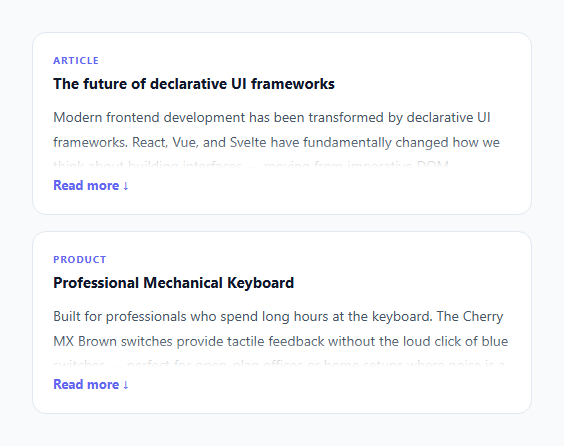
A read more / read less toggle lets you show a preview of long content with an expand option — keeping cards, product descriptions, and article excerpts compact without truncating text abruptly. This snippet implements the complete pattern: a CSS max-height clamp that shows exactly 3 lines, a gradient fade-out overlay that signals more content below, a smooth expand/collapse transition, and a "Read more / Read less" button with a rotating arrow indicator.
The max-height clamp approach
The content div starts with max-height: 4.5em (approximately 3 lines at 1.5em line-height × 3). CSS overflow: hidden clips any text beyond this height. The CSS transition: max-height 0.4s ease animates the expand. The expanded state sets max-height: 600px — a value safely larger than any realistic content height.
The gradient fade overlay
The .clamped::after pseudo-element applies a linear-gradient from transparent to the card background colour. This creates the impression that the text fades out naturally rather than being cut off sharply. The height is 2em, covering the last line and half of the second-to-last line. pointer-events: none prevents the overlay from intercepting clicks on the text.
Why max-height, not height: auto
CSS cannot transition from height: auto to a pixel value or vice versa. max-height solves this: transition from 4.5em (clamped) to 600px (expanded) works smoothly. The trade-off: the transition speed is not constant — it takes the same 0.4s whether the content is 5 lines or 20 lines. For most card descriptions, this is imperceptible.
The toggle logic
The toggle() function calls classList.toggle('expanded') on the content element and reads the returned boolean. This single call both adds/removes the class and tells us the new state. No separate isExpanded variable needed — the DOM class IS the state.
The rotating arrow indicator
The .rm-btn::after pseudo-element shows ↓ via CSS content. The .expanded class applies transform: rotate(180deg), turning it into ↑. The CSS transition: transform 0.3s animates the rotation in sync with the content expanding. No SVG or image needed.
Accessibility considerations
The .rm-btn should communicate its purpose to screen readers. Add aria-expanded="false" initially, toggling to "true" on expand. Add aria-controls="rm1-content" pointing to the content element ID. Update in the toggle() function: btn.setAttribute("aria-expanded", isExpanded). The gradient overlay has pointer-events: none so keyboard users can still interact with any links inside the clamped text.
Build with AI
Build, Understand, Optimize, and Extend It With AI
You do not have to puzzle out the max-height trick by hand. Paste this snippet's HTML, CSS, and JS into an AI coding assistant like Claude and ask it to explain exactly why the component transitions max-height instead of height, and why the collapsed and expanded states use two very different fixed values (4.5em versus 600px) rather than something more precise. The same assistant can help you optimize it — ask how you would detect when content is already shorter than the clamp height (comparing scrollHeight to clientHeight) so the "Read more" button never shows for text that does not need it. It's also useful for extending the component: ask it to make the collapse animation duration scale with content length instead of a fixed 0.4s, add a "Read more" link that deep-links to an anchor in the full article instead of expanding inline, or support nested read-more sections inside a longer expanded block. Treat the code less like a finished artifact and more like a starting point for a conversation.
Prompt to recreate it
Copy this into your AI assistant of choice to build the effect from scratch, or as a jumping-off point for your own variant:
Build a "read more / read less" text truncation component in plain HTML, CSS, and JavaScript with no library.

Requirements:
- Clamp the content container to approximately three lines of text using max-height (not height) with overflow hidden, since CSS cannot transition to or from an auto height value.
- Add a gradient fade overlay using a pseudo-element positioned over the bottom of the clamped content, fading from transparent to the container's background color, with pointer-events set to none so it never blocks clicks or text selection on the content beneath it.
- Add a toggle button that switches the content between the clamped state and an expanded state (a much larger fixed max-height value, safely bigger than any realistic content), animated with a CSS transition on max-height.
- Use classList.toggle's own boolean return value as the single source of truth for whether the content is expanded — do not track a separate JavaScript variable that could drift out of sync with the DOM class.
- Add a small arrow indicator on the button that rotates 180 degrees via a CSS transform transition when expanded, synced to the same toggle.
- Implement a check that compares the content element's scrollHeight to its clientHeight after render, and hides the toggle button entirely when the content is already short enough to fit without clamping.
Want to tighten it up first? Run this prompt through the AI Prompt Studio to score it across 8 quality dimensions, catch anti-patterns, and tune the wording for Claude, ChatGPT, or Gemini before you paste it in.
Step by step
How to Use
- 1Click "Read more" to expand the contentThe card expands with a smooth max-height animation. The gradient fade disappears. The button changes to "Read less" with the arrow flipping to point up. Click again to collapse.
- 2Adjust the clamp heightChange max-height: 4.5em on .rm-content.clamped to control how many lines show. 3em = ~2 lines, 4.5em = ~3 lines, 6em = ~4 lines. Also adjust the ::after gradient height to match the last visible line.
- 3Match the gradient to your backgroundUpdate the linear-gradient in .rm-content.clamped::after from #fff to your card background colour. For a dark card, use rgba(0,0,0,0) → your dark bg colour. Without matching, the gradient overlay is visible as a white stripe.
- 4Use for any content lengthThe snippet works with any amount of text. Short content that fits within the clamp height shows no gradient and the button is still visible — consider hiding the button when content is short: measure scrollHeight vs clientHeight and hide if equal.
- 5Hide the button when content fitsAfter the component renders, check: if (content.scrollHeight <= content.clientHeight) btn.style.display = "none". This hides the "Read more" button when the content is already fully visible within the clamp height.
- 6Export in your formatClick "HTML" for a standalone file, "JSX" for a React component with expanded state in useState, or "Tailwind" for a React + Tailwind CSS version.
Real-world uses
Common Use Cases
Got questions?
Frequently Asked Questions
CSS cannot transition between height: auto and a fixed pixel value because "auto" is not a computed length the browser can interpolate. max-height works because both states are explicit values: 4.5em (clamped) and 600px (expanded). The browser can interpolate between these. The trade-off: the animation takes the same duration (0.4s) whether the content is 4 lines or 40 lines, because the browser interpolates from 0 to 600px regardless of actual content height. For most use cases this is not noticeable.
After the page renders, check each content element: document.querySelectorAll(".read-more-wrap").forEach(wrap => { const content = wrap.querySelector(".rm-content"); const btn = wrap.querySelector(".rm-btn"); if (content.scrollHeight <= content.clientHeight + 2) { btn.style.display = "none"; content.classList.remove("clamped"); content.style.maxHeight = "none"; } }). The +2 pixel tolerance handles rounding. The content.scrollHeight is the actual content height; clientHeight is the clamped visible height.
Call a checkClamp() function after content is inserted into the DOM. For server-rendered pages, call it in DOMContentLoaded. For dynamically loaded content (infinite scroll, API-loaded cards), call checkClamp() in the callback after the new HTML is inserted. For React, call it in useEffect when the content prop changes: useEffect(() => checkClamp(contentRef.current), [content]).
Click "JSX" to download. Manage expanded with useState(false). Apply className based on state: className={"rm-content " + (expanded ? "expanded" : "clamped")}. The button calls setExpanded(prev => !prev). To hide the button when content is short: use a contentRef with useRef, and a useEffect that checks contentRef.current.scrollHeight <= contentRef.current.clientHeight after mount to set a showButton state.