



Learn Coding Visually
Learn to code with interactive, live-preview playgrounds — HTML, CSS, JavaScript, React & more.
 HTML Playground42 lessons · Click-based · Live preview
 CSS PlaygroundLearn CSS with a live editor
 JavaScript Playground60 lessons · DOM · Async · Canvas
 React PlaygroundLearn React with a live code editor
 GSAP PlaygroundLearn GSAP animation interactively
 SVG Playground44 lessons · shapes · paths · animation
 SCSS Playground45 lessons · Sass modules · tokens
 Tailwind PlaygroundLearn Tailwind CSS with a live editor
 Bootstrap 5 Playground50 lessons · live preview
Newspaper Column Layout — CSS Multi-Column Text Snippet
Newspaper Column Layout · Layouts · Plain HTML, CSS & JS · Live preview
What's included
Features
About this UI Snippet
Newspaper Column Layout — CSS Multi-Column Text Flow, Drop Caps & Pull Quotes
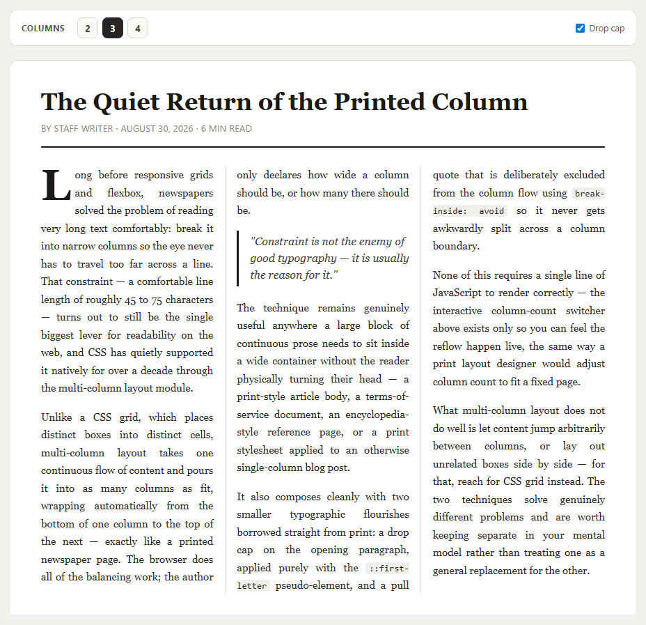
Most "layout" work on the web is really CSS grid or flexbox arranging distinct boxes — a header here, a sidebar there. Multi-column text layout solves a completely different problem: taking one continuous stream of prose and pouring it into several narrow columns so a reader's eye never has to travel too far across a line, exactly the way a physical newspaper page has worked for over a century. This snippet builds a full print-style article — headline, byline, multi-column body, drop cap, and pull quote — using nothing but the CSS multi-column module, and adds a small live control panel so you can feel the reflow happen.
The column property that does all the work
The article body sits inside a single .np-columns container. Setting column-width: 220px tells the browser "make each column at least this wide, and fit as many as will comfortably reflow into the available space" — no manual column-count math required at any given viewport size. The toolbar buttons override this by writing an explicit column-count of 2, 3, or 4 via a data-count attribute, which is exactly what a print designer does when fitting copy to a fixed page width instead of a fluid one.
Why line length is the actual point
The 45–75 character comfortable reading-line-length rule is older than the web, and multi-column layout is the most direct way to honor it inside a wide container. A single long paragraph stretched across an 900px-wide page forces a reader's eye to travel and re-find the start of the next line on every pass; splitting the same text into 220px columns keeps every line short regardless of how wide the surrounding page happens to be.
The drop cap with zero markup
The oversized first letter uses only ::first-letter targeted at the first paragraph inside .np-columns.dropcap — no wrapping <span>, no extra element in the HTML. float: left combined with a large font-size and a negative-feeling line-height pulls the following lines of that paragraph up around the letter, the same optical trick print typesetters have used for centuries, toggled here purely by adding or removing one class.
Keeping a quote from being split in half
Multi-column layout will happily break any element across a column boundary if it runs out of vertical room — including, by default, a pull quote, which looks broken and unprofessional split mid-sentence between two columns. break-inside: avoid on .np-pullquote tells the browser to treat that block as atomic: if it does not fully fit in the remaining space of the current column, push the *whole* block down to the top of the next one instead of slicing it.
Where multi-column beats a grid, and where it does not
Multi-column layout is the right tool specifically for one long flow of readable prose — an article body, a document, a reference page, or a print stylesheet. It is the wrong tool for arranging distinct, independently-sized boxes like cards or a dashboard, which is squarely what CSS grid is for; content does not "flow" between grid cells the way it does between columns, and grid gives you no equivalent of automatic column balancing for a single stream of text. Keeping the two mental models separate — grid for boxes, columns for prose — avoids reaching for the wrong primitive on either kind of page.
Build with AI
Build, Understand, Optimize, and Extend It With AI
Paste this snippet's HTML and CSS into an AI coding assistant like Claude and ask it to explain exactly why column-width lets the browser choose the column count automatically while column-count forces an exact number regardless of available space, and when you would reach for one over the other. It is also a good candidate for extension — ask it to add a "column-span: all" pull-quote variant that breaks across the full article width at a chosen point in the text, build a print stylesheet variant of the same markup for a genuinely print-ready PDF export, or wire the column-count toolbar into a persisted user preference stored in localStorage so returning readers keep their chosen density.
Prompt to recreate it
Copy this into your AI assistant of choice to build the effect from scratch, or as a jumping-off point for your own variant:
Build a newspaper-style article layout in plain HTML, CSS, and JavaScript using the CSS multi-column layout module — no grid or flexbox for the text flow, no library.

Requirements:
- An article with a headline that spans the full width above the columns (using column-span: all), a byline, and a body of several paragraphs that flows automatically into multiple narrow columns using column-width (not a fixed column-count) so the browser decides how many columns fit the available space.
- A toolbar with buttons to explicitly override the column count to 2, 3, or 4 columns, demonstrating the difference between an author-forced column-count and the browser's automatic column-width based reflow.
- A drop cap on the first paragraph's first letter implemented purely with the ::first-letter pseudo-element (no extra wrapping markup), toggleable on and off via a checkbox.
- A pull quote block that uses break-inside: avoid so it is never split across a column boundary, styled with a left border and italic text distinct from the body paragraphs.
- Justified body text with automatic hyphenation for a print-like reading rhythm, and a vertical column-rule divider between columns.
- A responsive collapse to a single column below a small viewport width, regardless of which column count was selected.
Want to tighten it up first? Run this prompt through the AI Prompt Studio to score it across 8 quality dimensions, catch anti-patterns, and tune the wording for Claude, ChatGPT, or Gemini before you paste it in.
Source Code
<div class="np-page">
  <div class="np-toolbar">
    <span class="np-toolbar-label">Columns</span>
    <div class="np-col-btns" id="npColBtns">
      <button type="button" data-cols="2">2</button>
      <button type="button" data-cols="3" class="active">3</button>
      <button type="button" data-cols="4">4</button>
    </div>
    <label class="np-toggle">
      <input type="checkbox" id="npDropcap" checked>
      Drop cap
    </label>
  </div>

  <article class="np-article" id="npArticle">
    <h1>The Quiet Return of the Printed Column</h1>
    <p class="np-byline">By Staff Writer · August 30, 2026 · 6 min read</p>

    <div class="np-columns">
      <p>Long before responsive grids and flexbox, newspapers solved the problem of reading very long text comfortably: break it into narrow columns so the eye never has to travel too far across a line. That constraint — a comfortable line length of roughly 45 to 75 characters — turns out to still be the single biggest lever for readability on the web, and CSS has quietly supported it natively for over a decade through the multi-column layout module.</p>
      <p>Unlike a CSS grid, which places distinct boxes into distinct cells, multi-column layout takes one continuous flow of content and pours it into as many columns as fit, wrapping automatically from the bottom of one column to the top of the next — exactly like a printed newspaper page. The browser does all of the balancing work; the author only declares how wide a column should be, or how many there should be.</p>
      <figure class="np-pullquote">
        <blockquote>"Constraint is not the enemy of good typography — it is usually the reason for it."</blockquote>
      </figure>
      <p>The technique remains genuinely useful anywhere a large block of continuous prose needs to sit inside a wide container without the reader physically turning their head — a print-style article body, a terms-of-service document, an encyclopedia-style reference page, or a print stylesheet applied to an otherwise single-column blog post.</p>
      <p>It also composes cleanly with two smaller typographic flourishes borrowed straight from print: a drop cap on the opening paragraph, applied purely with the <code>::first-letter</code> pseudo-element, and a pull quote that is deliberately excluded from the column flow using <code>break-inside: avoid</code> so it never gets awkwardly split across a column boundary.</p>
      <p>None of this requires a single line of JavaScript to render correctly — the interactive column-count switcher above exists only so you can feel the reflow happen live, the same way a print layout designer would adjust column count to fit a fixed page.</p>
      <p>What multi-column layout does not do well is let content jump arbitrarily between columns, or lay out unrelated boxes side by side — for that, reach for CSS grid instead. The two techniques solve genuinely different problems and are worth keeping separate in your mental model rather than treating one as a general replacement for the other.</p>
    </div>
  </article>
</div>
* { box-sizing: border-box; margin: 0; padding: 0; }
body { font-family: Georgia, 'Times New Roman', serif; background: #f1f0ec; padding: 32px 18px; }
.np-page { max-width: 900px; margin: 0 auto; }
.np-toolbar {
display: flex; align-items: center; gap: 18px; flex-wrap: wrap;
background: #fff; border: 1px solid #ddd8cd; border-radius: 10px;
padding: 10px 16px; margin-bottom: 20px; font-family: system-ui, sans-serif;
}
.np-toolbar-label { font-size: 12px; font-weight: 700; color: #57534e; text-transform: uppercase; letter-spacing: .04em; }
.np-col-btns { display: flex; gap: 6px; }
.np-col-btns button {
width: 30px; height: 30px; border-radius: 7px; border: 1px solid #ddd8cd;
background: #faf9f6; color: #44403c; font-weight: 700; font-size: 13px;
cursor: pointer; font-family: inherit;
}
.np-col-btns button:hover { background: #f1efe9; }
.np-col-btns button.active { background: #292524; color: #fff; border-color: #292524; }
.np-toggle { display: flex; align-items: center; gap: 6px; font-size: 12.5px; color: #57534e; margin-left: auto; cursor: pointer; }
.np-article { background: #fff; border: 1px solid #ddd8cd; border-radius: 12px; padding: 40px 44px; }
.np-article h1 {
font-size: 34px; line-height: 1.15; color: #1c1917; margin-bottom: 10px;
column-span: all;
}
.np-byline {
font-family: system-ui, sans-serif; font-size: 12.5px; color: #8b8378;
text-transform: uppercase; letter-spacing: .04em; margin-bottom: 26px;
padding-bottom: 18px; border-bottom: 2px solid #1c1917;
column-span: all;
}
.np-columns {
column-width: 220px;
column-gap: 34px;
column-rule: 1px solid #e3ded2;
color: #292524;
transition: column-width .2s;
}
.np-columns[data-count="2"] { column-count: 2; column-width: auto; }
.np-columns[data-count="3"] { column-count: 3; column-width: auto; }
.np-columns[data-count="4"] { column-count: 4; column-width: auto; }
.np-columns p { font-size: 15px; line-height: 1.7; margin-bottom: 16px; text-align: justify; hyphens: auto; }
.np-columns.dropcap p:first-of-type::first-letter {
float: left; font-size: 62px; line-height: 0.78; font-weight: 700;
padding: 4px 6px 0 0; color: #1c1917;
}
.np-pullquote { break-inside: avoid; margin: 6px 0 18px; padding: 4px 0 4px 16px; border-left: 3px solid #1c1917; }
.np-pullquote blockquote { font-size: 16px; font-style: italic; color: #44403c; line-height: 1.5; }
.np-columns code { font-family: ui-monospace, Menlo, monospace; background: #f1efe9; padding: 1px 5px; border-radius: 4px; font-size: 13px; }
@media (max-width: 640px) {
.np-article { padding: 26px 20px; }
.np-article h1 { font-size: 24px; }
.np-columns[data-count="3"], .np-columns[data-count="4"] { column-count: 1; }
}var wrap = document.querySelector('.np-columns');
var btns = document.querySelectorAll('#npColBtns button');
var dropcapBox = document.getElementById('npDropcap');
wrap.classList.add('dropcap');
wrap.setAttribute('data-count', '3');
btns.forEach(function (btn) {
btn.addEventListener('click', function () {
btns.forEach(function (b) { b.classList.remove('active'); });
btn.classList.add('active');
wrap.setAttribute('data-count', btn.dataset.cols);
});
});
dropcapBox.addEventListener('change', function () {
wrap.classList.toggle('dropcap', dropcapBox.checked);
});Step by step
How to Use
- 1Switch column countClick 2, 3, or 4 in the toolbar to see the exact same prose reflow live into a different number of columns — the browser rebalances every line break automatically.
- 2Toggle the drop capUncheck "Drop cap" to see the opening paragraph without the oversized first letter, applied purely via ::first-letter.
- 3Replace the article textSwap the paragraphs inside .np-columns for your own content — no markup changes are needed for the column flow to keep working.
- 4Adjust the base column widthChange the 220px value in column-width to control how narrow or wide each column is at its default (unforced) state.
- 5Protect other elements from splittingAdd break-inside: avoid to any block (an image caption, a table, a code sample) you never want sliced across a column boundary.
- 6Export in your frameworkUse the HTML, JSX, Vue, or Tailwind export buttons to drop this article shell into your own project.
Real-world uses
Common Use Cases
Got questions?
Frequently Asked Questions
CSS grid places distinct, independently-defined boxes into named cells or tracks. Multi-column layout instead takes one continuous flow of content and pours it into as many columns as fit, wrapping automatically from the bottom of one column to the top of the next — there is no per-item placement, only a single flowing stream.
column-count fixes an exact number of columns regardless of container width, letting each column stretch or shrink to fill the space. column-width instead sets a target minimum width per column and lets the browser decide how many columns fit — the container drives the count rather than an author-chosen number.
::first-letter is a native CSS pseudo-element built exactly for this purpose, so no extra markup is needed and the styling automatically applies to whichever character is actually first, even if the paragraph text changes. Wrapping a literal letter in a span requires manually keeping markup and content in sync.
By default, the browser is free to split any block-level element across a column boundary if it does not fit in the remaining vertical space of the current column, which can visually cut a quote in half between two columns. break-inside: avoid tells the browser to treat that element as atomic and push it whole to the next column instead.
Yes — images flow as part of the column content by default. For an image you want to break out of the column width (e.g. a wide photo), add break-inside: avoid so it is not sliced, or give it column-span: all to make it span every column at that point in the flow, the same as the headline does here.
Yes. The multi-column CSS is framework-agnostic — render the article body as a single flowing block of children and toggle the data-count attribute (or an equivalent CSS class/style binding) from component state the same way the vanilla JS toolbar does here.