More Forms Snippets
Front-End Coding Playgrounds
Learn to code with interactive, live-preview playgrounds — HTML, CSS, JavaScript, React & more.
 HTML Playground42 lessons · Click-based · Live preview
 CSS PlaygroundLearn CSS with a live editor
 JavaScript Playground60 lessons · DOM · Async · Canvas
 React PlaygroundLearn React with a live code editor
 GSAP PlaygroundLearn GSAP animation interactively
 SVG Playground44 lessons · shapes · paths · animation
 SCSS Playground45 lessons · Sass modules · tokens
 Tailwind PlaygroundLearn Tailwind CSS with a live editor
 Bootstrap 5 Playground50 lessons · live preview
Date Range Picker HTML CSS JS — Dual Calendar Popup
Date Range Picker · Forms · Plain HTML, CSS & JS · Live preview
What's included
Features
About this UI Snippet
Date Range Picker — How to Build a Dual-Calendar Date Range Picker in HTML, CSS, and JavaScript
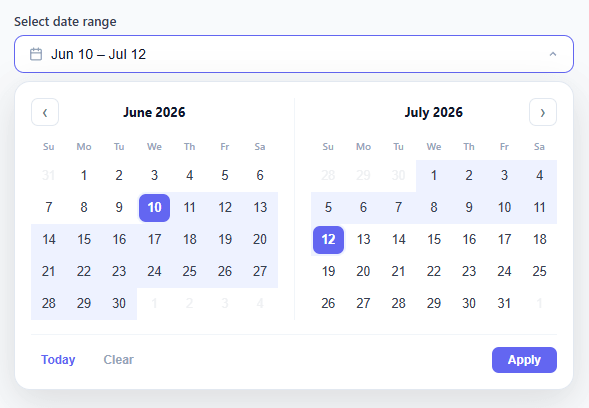
A date range picker is one of the most complex form components to build correctly. Unlike a single date picker, it must handle two selection points (start and end), a live hover preview showing the range in flight, dual month panels that stay synchronized, month navigation that respects both panels, keyboard accessibility, and click-outside-to-close — all in a single compact popup.
This snippet builds a complete, production-quality date range picker entirely in HTML, CSS, and vanilla JavaScript — no Flatpickr, no date-fns, no external calendar library.
State Machine Design
The picker has three selection states, tracked by two Date variables — start and end — and one hover variable:
1. No selection — both null. First click sets start, leaves end null.
2. Start selected, no end — first half of range. Hovering cells updates hovering, repainting the preview. Second click sets end. If end < start, the two are swapped.
3. Range complete — both set. Clicking a new cell resets to state 1 and starts a new range.
This three-state machine is the core of the component. Every calendar render reads start, end, and hovering to determine the class of each day cell: selected-start, selected-end, in-range, hover-preview, today, or plain.
Dual Month Panel Architecture
Two month panels render side by side. The left panel shows the month at cursorMonth and cursorYear. The right panel always shows the next month. Navigation arrows advance or retreat cursorMonth (adjusting cursorYear when crossing December or January) and re-render both panels.
Each panel is rendered by renderPanel(container, year, month). This function: computes the first day of the month (using new Date(year, month, 1).getDay() to get the starting weekday), fills empty cells before day 1 for alignment, generates day cells 1 through the month's last day, and appends them to the grid container.
Computing Month Start Day and Empty Cells
The calendar grid has 7 columns (Sun–Sat). new Date(year, month, 1).getDay() returns 0–6 for the weekday of the first of the month. If the first falls on Wednesday (day 3), three empty <div class="cal-cell empty"> elements are prepended before day 1 to shift it into the correct column. Days from the previous month are NOT shown — only blank placeholders — matching the common pattern used by Google Calendar, Airbnb, and most date pickers.
Live Hover Preview
While the user has selected a start date but not yet an end date, moving the mouse over any day cell fires a mouseover event. The handler sets hovering = new Date(year, month, day) and calls renderBothPanels() to repaint with the updated preview. Cells between start and hovering receive the hover-preview class (a lighter shade than the confirmed in-range class), giving users instant visual feedback before they click.
This re-render-on-hover approach is simpler than maintaining a separate preview layer and scales to any number of cells without DOM manipulation.
Range Cell Classification
For each day cell, the renderer checks three conditions:
- Is this day === start? → class selected-start (rounded left cap)
- Is this day === end? → class selected-end (rounded right cap)
- Is this day between start and end (or between start and hovering)? → class in-range or hover-preview (flat fill)
Date comparison uses integer arithmetic: d.getTime() returns milliseconds since epoch. isSameDay(a, b) checks year, month, and date equality. isBefore(a, b) and isAfter(a, b) compare epoch values. This avoids any timezone ambiguity from direct Date subtraction.
Popup Open/Close and Click Outside
The popup is position: absolute below the trigger button. It opens with a CSS class toggle that sets opacity: 1, transform: translateY(0), and pointer-events: auto. Click-outside detection uses a mousedown event listener on document — if e.target.closest('.picker-wrap') is null (the click was outside the entire picker), the popup closes. The listener is added on open and removed on close to avoid stacking multiple listeners.
Keyboard Navigation
The trigger button has aria-haspopup="true" and the popup has role="dialog" aria-modal="true". When open, keydown on the document handles: Escape closes the popup. Arrow key navigation through day cells requires tabindex management — day cells get tabindex="0" and ArrowLeft/Right/Up/Down move focus between them. This matches WCAG date picker guidance.
Output Format
A getValue() function returns { start: Date, end: Date | null } for programmatic access. The display string uses toLocaleDateString('en-US', { month: 'short', day: 'numeric', year: 'numeric' }) to format both dates as "Jun 10, 2025 – Jun 20, 2025" in the trigger button label.
Build with AI
Build, Understand, Optimize, and Extend It With AI
Rather than tracing every branch of the selection logic yourself, paste this snippet's HTML, CSS, and JS into an AI coding assistant like Claude and ask it to walk through exactly how the pick() function decides between anchoring a new start, swapping start and end when the second click lands earlier, or resetting the range entirely, and why the hover() guard checks sameDay(hovering, date) before re-rendering. The same assistant is useful for optimizing it, for instance asking whether renderPanel() rebuilding both months' full innerHTML on every single mouseenter is necessary or whether only the affected cells need new classes. It also helps with extending the picker: ask it to add preset ranges like "last 7 days," a minimum/maximum span constraint between start and end, or disabled dates for already-booked periods. Treat the code less like a finished artifact and more like a starting point for a conversation.
Prompt to recreate it
Copy this into your AI assistant of choice to build the effect from scratch, or as a jumping-off point for your own variant:
Build a two-month date range picker in plain HTML, CSS, and JavaScript with no external date library.

Requirements:
- A trigger button that opens a popup containing two side-by-side month calendar panels, where the right panel always shows the month immediately after the left panel's cursor month, and both panels re-render together whenever navigation changes the cursor.
- Selection must follow a two-phase model with a single pick(date) function: if there is no start, or both start and end are already set, treat the click as a fresh start and clear end; otherwise treat the click as setting end, auto-swapping start and end if the clicked date is earlier than the current start.
- While a start is set but end is not, track a separate hovering date on mouseenter over day cells, and highlight every day between start and hovering (or start and end once confirmed) using a background strip with rounded end caps on the first and last cell of the range.
- Guard the hover handler so that re-rendering the grid (which recreates the DOM node under the cursor) does not retrigger a new mouseenter event and cause an infinite render loop.
- Add Today, Clear, and Apply buttons in the footer, plus a document-level click listener using event.composedPath() (not closest()) to detect outside clicks, since composedPath must be captured before any DOM rebuild removes the originally clicked element.
- Expose a getValue() function returning { start, end } as Date objects (or null) so a host page can read the selected range programmatically.
Step by step
How to Use
- 1Open the pickerClick the trigger button with the calendar icon. The dual-month popup opens with the current month on the left and next month on the right.
- 2Click the start dateClick any day to set the range start. The cell highlights with a filled circle and the end date clears if one was previously set.
- 3Hover to preview the rangeMove the mouse over any day after the start. Cells between start and the hovered day highlight in a lighter shade showing the range preview before you commit.
- 4Click the end dateClick any day to set the range end. If you click before the start date, start and end are automatically swapped. The trigger button updates with the formatted date range.
- 5Navigate monthsClick the < and > arrows to move backward or forward one month. Both panels shift together — left shows the new month, right shows the next one.
- 6Read the selected rangeCall getValue() to get { start: Date, end: Date } programmatically. Use these Date objects in a form submit handler, API call, or query string builder.
Real-world uses
Common Use Cases
Got questions?
Frequently Asked Questions
When start is set but end is null, a mouseover listener on the calendar grid reads the hovered day cell's data-date attribute and sets the hovering state variable. The full dual-panel render is called immediately, and each day cell between start and hovering receives the hover-preview class (lighter background). Because the render is fast (no DOM diffing, just clearing and recreating cells), the preview feels instant. On the second click, hovering is cleared and end is set, converting the preview cells to confirmed in-range cells.
cursorMonth ranges 0–11. When the > (forward) arrow is clicked: cursorMonth++; if (cursorMonth > 11) { cursorMonth = 0; cursorYear++; }. When < (backward) arrow is clicked: cursorMonth--; if (cursorMonth < 0) { cursorMonth = 11; cursorYear--; }. The right panel always renders month (cursorMonth + 1) % 12 with the correct year (cursorYear + 1 if cursorMonth is December). This correctly handles the December → January year-wrap.
In renderPanel(), add a check before creating each day cell: const isPast = d < today; if (isPast) { cell.classList.add("disabled"); cell.tabIndex = -1; return; }. The CSS .cal-cell.disabled { opacity: 0.35; cursor: not-allowed; pointer-events: none; } prevents interaction. For blocked date ranges (e.g., already-booked), check against an array of { start, end } blocked periods and add "blocked" class similarly.
In the day cell click handler, when end is being set: const diffDays = Math.round((endDate - start) / 86400000); if (diffDays > MAX_DAYS) { showError("Maximum " + MAX_DAYS + " days"); return; }. Also add the constraint in the hover preview: cells beyond MAX_DAYS from start get a "out-of-range" class and a cursor: not-allowed style.
Add two hidden inputs to your form: <input type="hidden" name="startDate" id="hidden-start"> and <input type="hidden" name="endDate" id="hidden-end">. In the click handler when end is set: document.getElementById("hidden-start").value = start.toISOString().slice(0,10); document.getElementById("hidden-end").value = end.toISOString().slice(0,10);. These ISO strings serialize correctly in a standard HTML form submit or a fetch() body.
Yes. Click JSX for a React component, Vue for a Vue 3 SFC, Angular for a standalone component, or Tailwind for a utility-class version. In React, keep startDate and endDate in useState and re-render the calendar grid from those values instead of mutating the DOM directly.