More Forms Snippets
Front-End Coding Playgrounds
Learn to code with interactive, live-preview playgrounds — HTML, CSS, JavaScript, React & more.
 HTML Playground42 lessons · Click-based · Live preview
 CSS PlaygroundLearn CSS with a live editor
 JavaScript Playground60 lessons · DOM · Async · Canvas
 React PlaygroundLearn React with a live code editor
 GSAP PlaygroundLearn GSAP animation interactively
 SVG Playground44 lessons · shapes · paths · animation
 SCSS Playground45 lessons · Sass modules · tokens
 Tailwind PlaygroundLearn Tailwind CSS with a live editor
 Bootstrap 5 Playground50 lessons · live preview
Time Picker — Free HTML CSS JS Dropdown Snippet
Time Picker · Forms · Plain HTML, CSS & JS · Live preview
What's included
Features
About this UI Snippet
Time Picker — Custom Time Input Dropdown, Scroll Columns, AM/PM Toggle & 24h Output in Vanilla JS
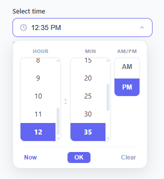
The native HTML <input type="time"> is one of the most inconsistently implemented form controls across browsers. On desktop Chrome it renders as a compact spinner with up/down arrows that are hard to click precisely; on iOS Safari it hijacks the full screen with a drum-roll picker that cannot be styled; on Firefox it presents a plain text field where users must type time manually; on Samsung Internet it opens yet another entirely different UI. None of these native controls can be styled to match your design system, none expose clean events that fire only when selection is complete, and none support features like a "Now" shortcut or automatic 5-minute rounding. Every time you reach for <input type="time"> in a production form, you are accepting unpredictable UI across your user base. This custom time picker replaces the native control entirely: a styled trigger button that shows the selected time, a panel with two scrollable columns for hours and minutes, a segmented AM/PM toggle, a Now shortcut, an OK button, a Clear button, and a 24-hour format helper — all in plain HTML, CSS, and vanilla JavaScript with zero dependencies and zero npm packages.
Data model: HOURS and MINUTES arrays
The picker is driven by two simple arrays at the top of the script: HOURS = [1,2,3,4,5,6,7,8,9,10,11,12] and MINUTES = [0,5,10,15,20,25,30,35,40,45,50,55]. This array-based model is the key architectural decision. It means the step size, the range, and the number of items are all controlled by editing one line — swap MINUTES to [0,15,30,45] for quarterly steps or Array.from({length:60},(_,i)=>i) for every-minute granularity without touching any rendering code. State is tracked in three variables: selectedHour (null or 1-12), selectedMinute (null or 0-55), and ampm (string "AM" or "PM"). Null values mean "nothing selected yet" and cause the trigger to show its placeholder text.
How the scroll columns work
The render() function is the single source of truth for both columns. It clears each container with innerHTML = '', then maps over HOURS and MINUTES using document.createElement to build each div.time-item. The selected item gets the .selected class which applies the indigo background and white text. Each item gets a click listener that calls selectHour(h) or selectMinute(m). After rebuilding, scrollIntoView({ block: 'nearest' }) is called on the selected element so it scrolls into view without snapping the whole page. The 5-minute increment grid for minutes is a deliberate UX choice — Google Calendar, Apple Calendar, and Outlook all default to 15 or 30-minute grids; 5-minute steps give more precision while still keeping the list at 12 items instead of 60.
AM/PM toggle design and state
The AM/PM selector uses two <button> elements inside a flex column container with overflow: hidden and a shared border — a classic segmented-control pattern that renders as a single compound widget. The active button gets the .active class (indigo background, white text); the inactive button stays transparent. setAmPm(val) updates the ampm state variable, toggles the class on both buttons, and calls updateDisplay() to refresh the trigger label and the 24h helper text simultaneously. Because AM/PM is independent of hour and minute selection, changing it never triggers a full render() — only a display update — keeping the interaction snappy.
The Now button and time rounding
setNow() reads new Date() to get the current local time. The raw minute from now.getMinutes() is rounded to the nearest 5-minute mark with Math.round(m / 5) * 5 % 60 — so 2:47 PM becomes 2:45 PM and 2:48 PM becomes 2:50 PM. The 24h hour is converted to 12h format with h % 12 || 12, which correctly maps hour 0 (midnight) to 12, hour 13 to 1, and so on. AM/PM is determined by h >= 12 before the modulo conversion. After setting all three state variables, render() and updateDisplay() are called to rebuild the columns and show the time in the trigger.
24h getValue() output for APIs and forms
The getValue() function converts the 12h picker state back to a 24-hour "HH:MM" string for use in APIs, forms, and backend date libraries. It starts with selectedHour % 12 which yields 0 for the 12 o'clock position (both 12 AM and 12 PM), then adds 12 if ampm === 'PM', producing the correct 24h hour in all edge cases. Both the hour and minute are zero-padded with padStart(2,'0') to guarantee the "HH:MM" format that <input type="hidden"> fields, ISO 8601 timestamps, REST APIs, and backend time parsers expect. The 24h string also appears in the helper text below the trigger (prefixed with "24h:") so users can verify the value without opening the picker again.
Opening animation and robust click-outside close
The dropdown panel uses opacity: 0 and transform: translateY(-6px) in its closed state. Adding the .open class transitions to opacity: 1 and translateY(0), creating a smooth downward reveal that takes 180ms — fast enough to feel instant but slow enough to feel polished. The transition is driven entirely by CSS so there is no JavaScript requestAnimationFrame loop and no layout thrashing. The click-outside close uses e.composedPath().includes(wrap) rather than e.target.closest(). This is important because the scroll column's render() rebuilds the DOM on every selection — if a clicked item is removed from the DOM before the event bubbles to document, e.target.closest() returns null and the picker closes unexpectedly. composedPath() captures the original event path at dispatch time, before any DOM mutation, so outside-click detection is reliable even after re-renders.
Build with AI
Build, Understand, Optimize, and Extend It With AI
Have an AI coding assistant like Claude walk through why the click-outside handler checks e.composedPath().includes(wrap) instead of the more common e.target.closest(wrap) — it's a subtle bug fix tied to render() rebuilding the DOM on every selection, and worth understanding before you copy the pattern elsewhere. It's also worth asking whether rebuilding both scroll-list columns from scratch on every single click is wasteful compared to just updating the .selected class on the two affected elements. For extending the picker, ask for keyboard arrow-key navigation within the open scroll columns, a way to disable specific times (like a booking system's blocked slots), or a compact inline variant that skips the dropdown and shows the columns directly in the page flow. Treat the code less like a finished artifact and more like a starting point for a conversation.
Prompt to recreate it
Copy this into your AI assistant of choice to build the effect from scratch, or as a jumping-off point for your own variant:
Build a custom time picker dropdown in plain HTML, CSS, and JavaScript that replaces the native input type="time" entirely — no native time input, no library.

Requirements:
- A trigger button showing the currently selected time (or a placeholder) that opens a panel containing two independently scrollable columns — one listing hours 1 through 12, one listing minutes in 5-minute increments from 00 to 55 — plus a segmented AM/PM toggle.
- Render both scroll columns from two plain arrays of numbers (not hardcoded markup), so changing the minute step to 15 or 30 minutes is a one-line array edit with no other code changes.
- Clicking an item in either column must update the selection, rebuild that column's highlighted state, and scroll the selected item into view with scrollIntoView using the "nearest" block option so it doesn't jump the whole page.
- Provide a "Now" button that reads the real current time, rounds the minutes to the nearest step in the MINUTES array, derives the correct AM/PM, and updates both columns and the toggle in one call.
- Expose a function that converts the picker's 12-hour internal state (hour, minute, AM/PM) into a zero-padded 24-hour "HH:MM" string suitable for forms and APIs, correctly mapping 12 AM to hour 00 and 12 PM to hour 12.
- Close the dropdown on Escape and on any click outside it, using the event's composed path (not a simple closest() check) so that a click on an option that gets removed from the DOM during a re-render still correctly registers as "inside" the picker before it closes.
Step by step
How to Use
- 1Click the trigger button to open the time panelThe panel slides down with a smooth opacity and translateY animation. Two scrollable columns appear — Hours (1-12) and Minutes (00-55 in 5-minute steps) — alongside the AM/PM toggle.
- 2Scroll the hour column and click your desired hourClick any hour from 1 to 12. The selected item is immediately highlighted in indigo. The column scrolls to keep your selection visible if it was off-screen.
- 3Scroll the minute column and click your desired minuteClick any minute value (00, 05, 10 ... 55). Once both hour and minute are selected, the trigger button label updates to show the formatted time, for example "2:30 PM".
- 4Toggle AM or PM using the segmented buttonClick AM or PM in the right column. The active segment fills with the accent colour. The trigger label and the 24h helper text below it update instantly to reflect the change.
- 5Use the Now button to jump to the current timeClick "Now" at the bottom of the panel. The picker reads the current system time, rounds the minutes to the nearest 5-minute mark, sets AM/PM automatically, and highlights the correct row in both columns.
- 6Read the selected value with getValue() or use the hidden input patternCall getValue() to receive the time as a "HH:MM" 24-hour string (e.g. "14:30"). To wire it to a form, add a hidden input and set its value in updateDisplay() with document.getElementById("time-value").value = getValue(). Click "Clear" to reset the picker to its empty state.
Real-world uses
Common Use Cases
setNow() and getValue() functions teach two time-handling patterns that every frontend developer needs: converting 12h to 24h format using h % 12 + (ampm === "PM" ? 12 : 0) (including the midnight/noon edge case), and rounding a raw minute to a discrete grid with Math.round(m / 5) * 5 % 60. These same patterns appear in countdown timers, calendar widgets, time-ago formatters, and any scheduling logic you will encounter in production apps.<input type="time"> renders as a drum wheel on iOS Safari, a plain text field on Firefox, a custom spinner on Chrome, and something else entirely on Samsung Internet — none of them styleable to match your design system. This custom picker renders pixel-identically in every browser, inherits your CSS custom properties, and can be themed to match any form component in your UI library. Swap the indigo #6366f1 accent to your brand color and the whole component updates without touching the JS.Got questions?
Frequently Asked Questions
Call getValue() which returns the time as a 24-hour "HH:MM" string (e.g. "14:30"), or an empty string if no time is selected. To include it in a standard HTML form POST, add a hidden input: <input type="hidden" name="appointment_time" id="time-value">. Then inside updateDisplay(), add a single line: document.getElementById("time-value").value = getValue(). On every selection change the hidden field stays in sync. The HH:MM format is accepted directly by Python (datetime.strptime(val, "%H:%M")), PHP (DateTime::createFromFormat("H:i", $val)), Ruby (Time.strptime(val, "%H:%M")), and Node.js (new Date("1970-01-01T" + getValue() + ":00Z")).
Edit the MINUTES constant at the top of the script. For 15-minute steps use const MINUTES = [0,15,30,45]. For 30-minute steps use const MINUTES = [0,30]. For every-minute granularity use const MINUTES = Array.from({length:60},(_,i)=>i). The render() function iterates over the MINUTES array to build the column, so any array of integers 0-59 works without any other code change. For long lists like 60 items, add scroll-snap-type: y mandatory on .scroll-list and scroll-snap-align: center on .time-item to give a mobile drum-picker feel. Also update setNow() to round to your step size: for 15-min steps change 5 to 15 in Math.round(m / 15) * 15 % 60.
Four changes are required. First, replace HOURS with Array.from({length:24},(_,i)=>i) to list hours 0-23. Second, hide the AM/PM column with .ampm-col { display: none }. Third, update selectHour(h) to store selectedHour = h without any 12h logic. Fourth, simplify getValue() to return String(selectedHour).padStart(2,"0") + ":" + String(selectedMinute).padStart(2,"0") without AM/PM conversion. Finally, update the trigger label format in updateDisplay() to use String(selectedHour).padStart(2,"0") + ":" + minStr. setNow() already uses getHours() which is 24h, so only remove the ampm line and the h % 12 || 12 conversion.
Call selectHour(), the internal state setters, and updateDisplay() after the script initialises. For example, to pre-select 9:00 AM: selectedHour = 9; selectedMinute = 0; ampm = "AM"; updateDisplay(). If you have a "HH:MM" string from a server (e.g. "14:30"), parse it first: const [hh, mm] = "14:30".split(":").map(Number); ampm = hh >= 12 ? "PM" : "AM"; selectedHour = hh % 12 || 12; selectedMinute = mm; updateDisplay(). Call render() as well if the panel might be opened invalid, so the correct items are highlighted when it first shows.